
Channel Surfing
Rethinking a familiar feature for the modern streaming age.
Since Xumo has traditional linear content, they wanted to find a way to breathe new life into channel browsing in order to improve discovery on the platform. Inspired by the traditional way of changing channels using the remote arrows, a new feature was created.
Channel Surfing is a quick way to allow users who are watching linear content to browse channels without having to leave the playback experience. The feature navigates a neighborhood of recommended and recent channels.
Final Product Preview
The user can quickly flip through channels within different categories in this lightweight, low-commitment player experience. Check out the product tour video! I recorded the fully prototyped design in Figma.
Now let’s go back and see how we got here.
Xumo is a streaming service with traditional and digital networks, presented as linear and on-demand channels. Navigate through 190+ channels, enjoy live events, breaking news, viral videos, full TV series, endless cartoons, and more. Often referred to as a FAST app (Free Ad-Supported Television).
Xumo is a joint venture of Charter Communications and Comcast.

What is Xumo?
Xumo x Comcast
I was a part of a small team and played a large role in the complete redesign and launch of the Xumo TV app. My responsibility during the redesign entailed the intake and evaluation of all current Xumo features and how they would work in our ecosystem. Everything was rebuilt and rethought to fit in our current Xfinity brand, design system guidelines, and design methodology.
Xumo brought new features that challenged the way some of our components work. For example, Xumo always has live video playing in the background, no matter what area of the experience the user is in. During this period, I worked on creating a new feature, Channel Surfing.

My Role
UX & UI
Designed the end-to-end experience from ideation to launch, as well as led the UX strategy.
Testing & Prototyping
Built multiple prototypes in Figma for user testing as well as stakeholder presentations.
Documentation
Building the spec documents while working with Product and Engineering teams to ensure launch accuracy.
The Objective
Xumo wanted to increase the number of users for its linear programs.
The main access point for discovering live content is the Live TV Guide. An important question for this task was – how do we create a more immersive way to browse content with low commitment?
I explored multiple ideas, but ultimately arrived at the Channel Surfing experience within the linear player.
Business Goals:
Improve channel discoverability
Create an easily accessible entry point
Provide value and not conflict with existing features
Visually engaging and different enough from Live Guide & Player
Entry Points
The team and I went through multiple options for where the access point of this feature could be in the current player experience.
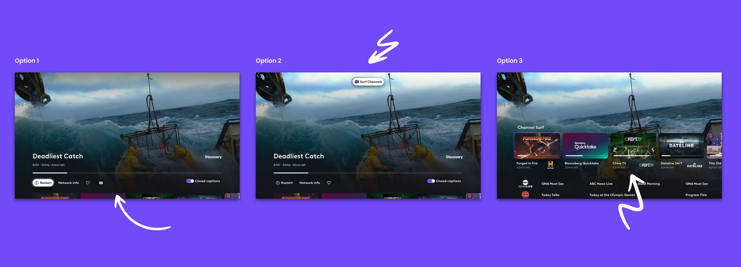
Entry Point Options
Option 1
Below the player bar are additional actions so the icon was placed there. However, it is not given much prominence.
Option 2
A button was placed at the top of the screen to differentiate itself as a new experience. Additional remote presses to access.
Option 3
Below the player is an existing row of recent channel tiles. It was proposed to reperuse the row and when the user moved right the video would update.
A new option that was chosen is remote logic created to access the lightweight channel surfing UI. While video is playing without any UI on screen. If. the user presses up or down on their remote, the Channel Surfing UI is opened. If they press left, right, or “ok” the standard player UI is opened. If the user presses “ok” while in Channel Surfing they are selecting the program and enter back into the standard player UI. If the user dwells for more than 10 seconds standard player UI is enabled.

Entry Point Solution
Initial Explorations
An essential objective for the feature was to make the experience clearly different than the normal playback UI. Multiple layouts were designed and prototyped to be presented in executive and stakeholder presentations.
Option 1
Below the player is an existing row of recent channel tiles. It was proposed to reperuse the row, and when the user moved right, the video would update.
Option 2
The video playing squeezes back into a row of tiles. As the user moves left and right, the tiles switch out the video playing.
Option 3 ✅
It was apparent that everyone enjoyed how lightweight the experience felt. This established a low-commitment exploration for the user. We were asked to add some more valuable metadata.
We ended up moving forward with this option.
Building Upon Option 3
More Metadata
Including more metadata like program duration, progress bar, and time left.
Category Tabs
A later addition to the requirements was the addition of category tabs that aggregated channels for quicker surfing.
Full Screen
Video will be full screen for a fully immersive experience.
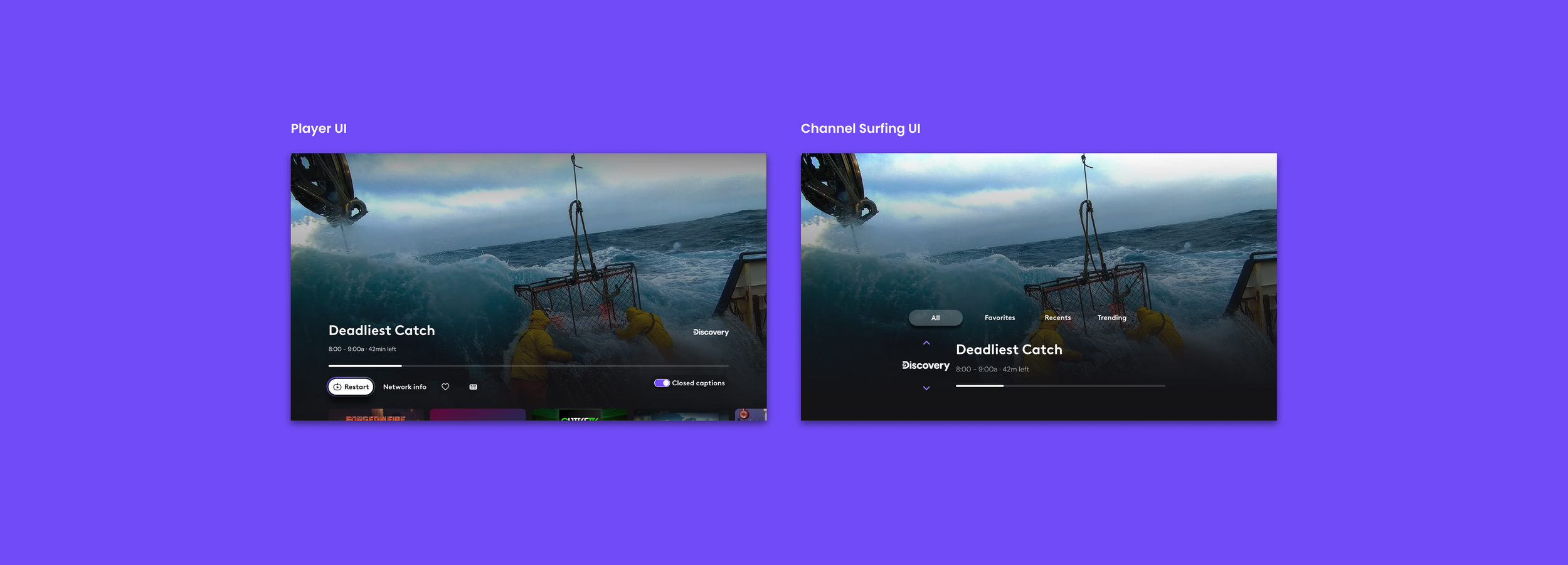
Final Product
The user can quickly flip through channels within different categories in this lightweight, low-commitment player experience. Pressing up and down changes the channel, while pressing left or right changes the category.
After launching this feature, the amount of time spent watching linear content on the platform doubled!