Content Details Redesign
While working at Samsung TV Plus, one of my first projects was redesigning the Content Details pages.
It’s one task to design an engaging interface, but it’s a whole other mountain to make the template replicable for the variety of assets you have.
Now, let’s take a step back and look at the context of this feature.
What is Samsung TV Plus?
Samsung TV Plus is a free streaming service installed on every Samsung TV. The product offers live TV channels as well as on-demand content with no subscription needed.
I am a part of a small team that works on the UX for the entire application.
The Objective
Samsung TV Plus is a FAST app, so a major focus is on linear content, but the platform also offers a large catalog of VOD movies and TV shows to be watched at the user’s leisure. One of the overall business goals for the year was to increase VOD consumption.
Business Goals:
Increase Monthly Active Users
Increase Hours of Viewing
Increase Number of VOD Users
Three strategies for achieving this goal:
Redesign the Content Details pages to look more premium
Improve the discoverability of related content
Create an autoplay feature (view that project here)
This case study outlines the methods and execution of the first two strategies!
My Role
UX & UI
Designed the end-to-end experience from ideation to launch, as well as led the UX strategy.
Testing & Prototyping
Collaborated with our Research team and prototyper to build and test out these solutions.
Documentation & QA
Building the spec documents while working with Product and Engineering teams to ensure launch accuracy. I also contribute to the QA of the feature while it is on staging.
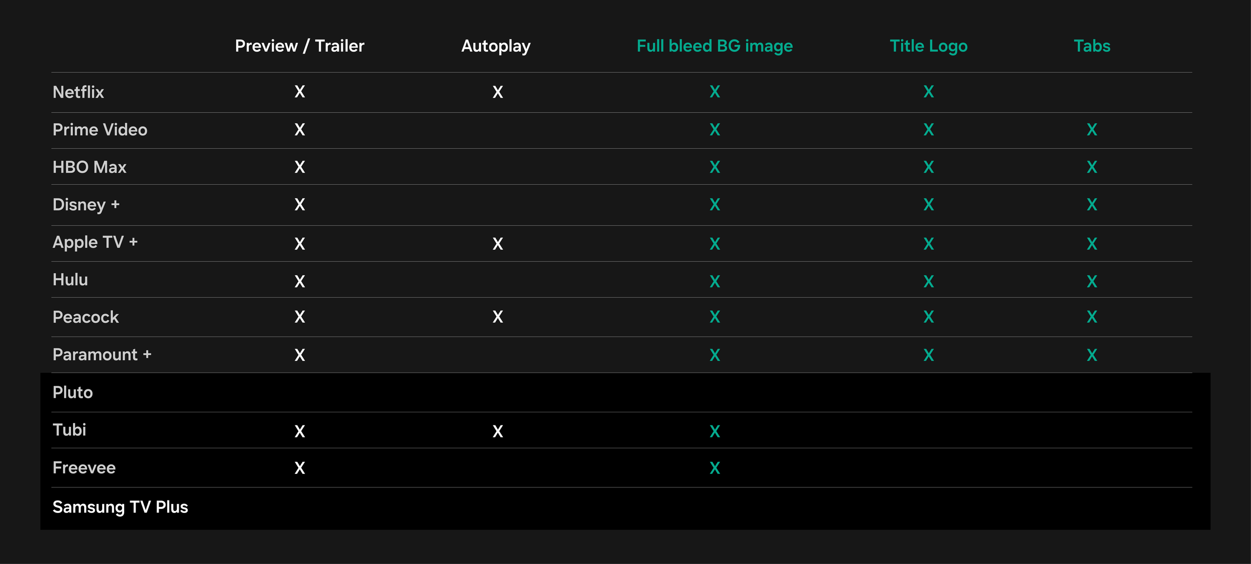
Competitor Study
After conducting a competitor study for our overall redesign of the content details pages, we saw that almost all of them utilized a full-bleed background image, as well as the logo title treatment for a movie or TV show. None of our competitors in the FAST arena were using a two-level tab structure, but we felt like this could elevate us to a more premium status.
The bottom apps grouped represent our FAST app competitors. When reviewing the competitive landscape, it’s important to keep in mind that the individual goals of streaming services vary.
Movie Redesign
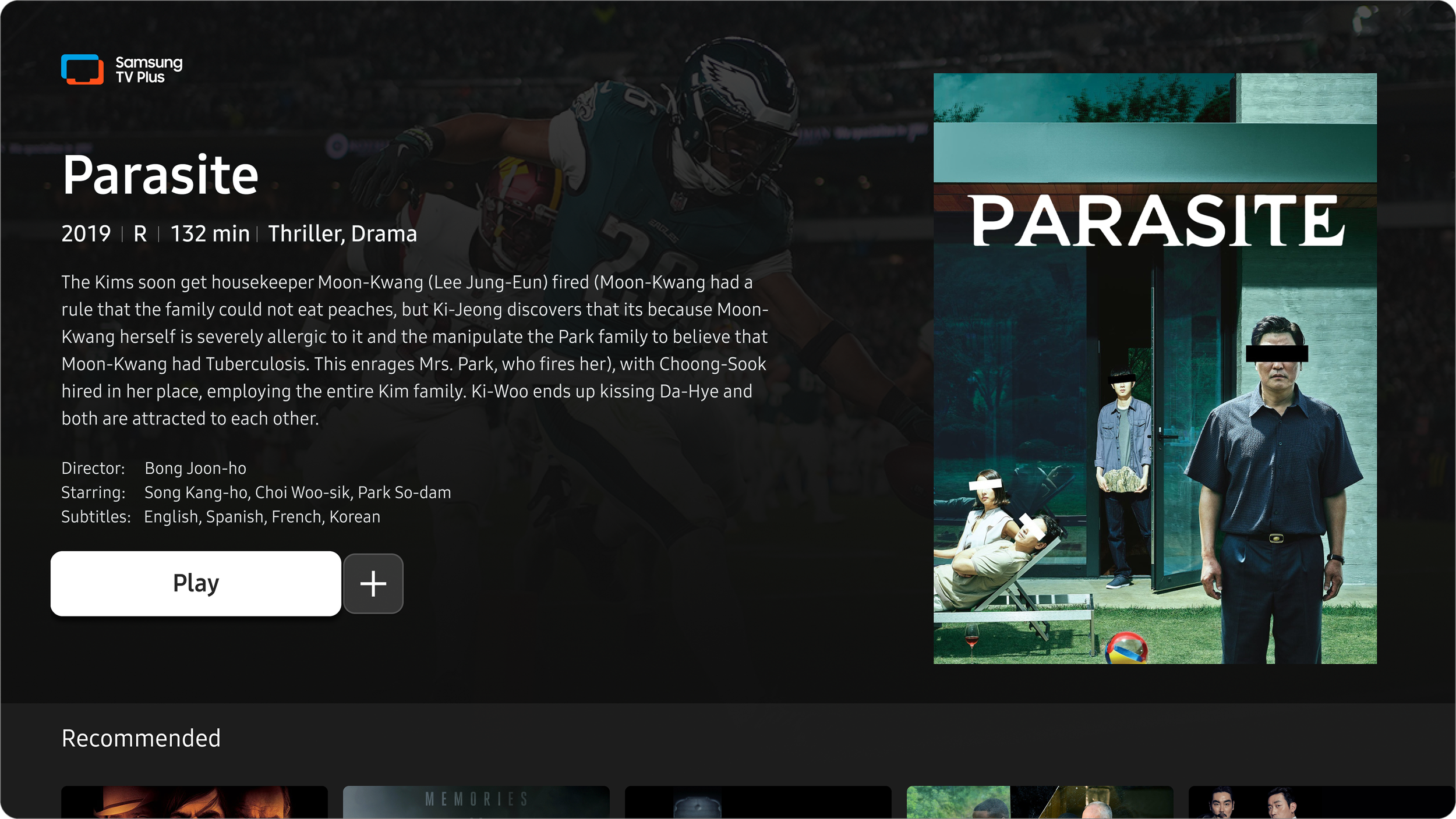
Before
Here is the before and after of the Movie page. Previously, it was very dense with information. Underneath the UI of the app, a live TV channel is always playing that you can see and hear under the scrim. In this example, you can see the Eagles game playing in the background. All of that movement, combined with a wall of information, made the experience frustrating.
Live video playing in the background
Single floating poster image
Redundant title in poster
High max character count
Unnecessary metadata
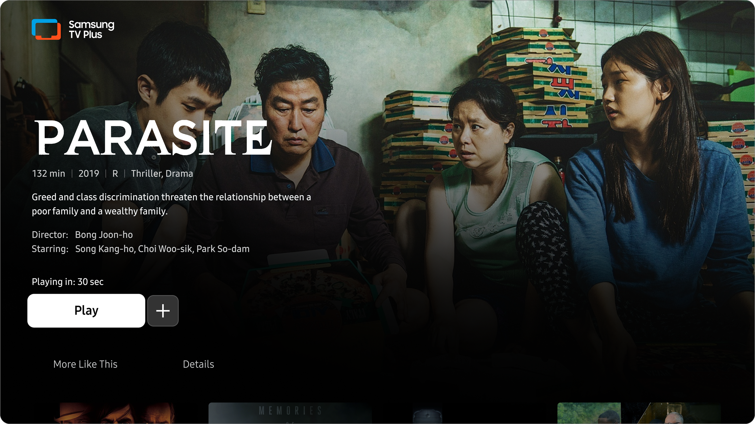
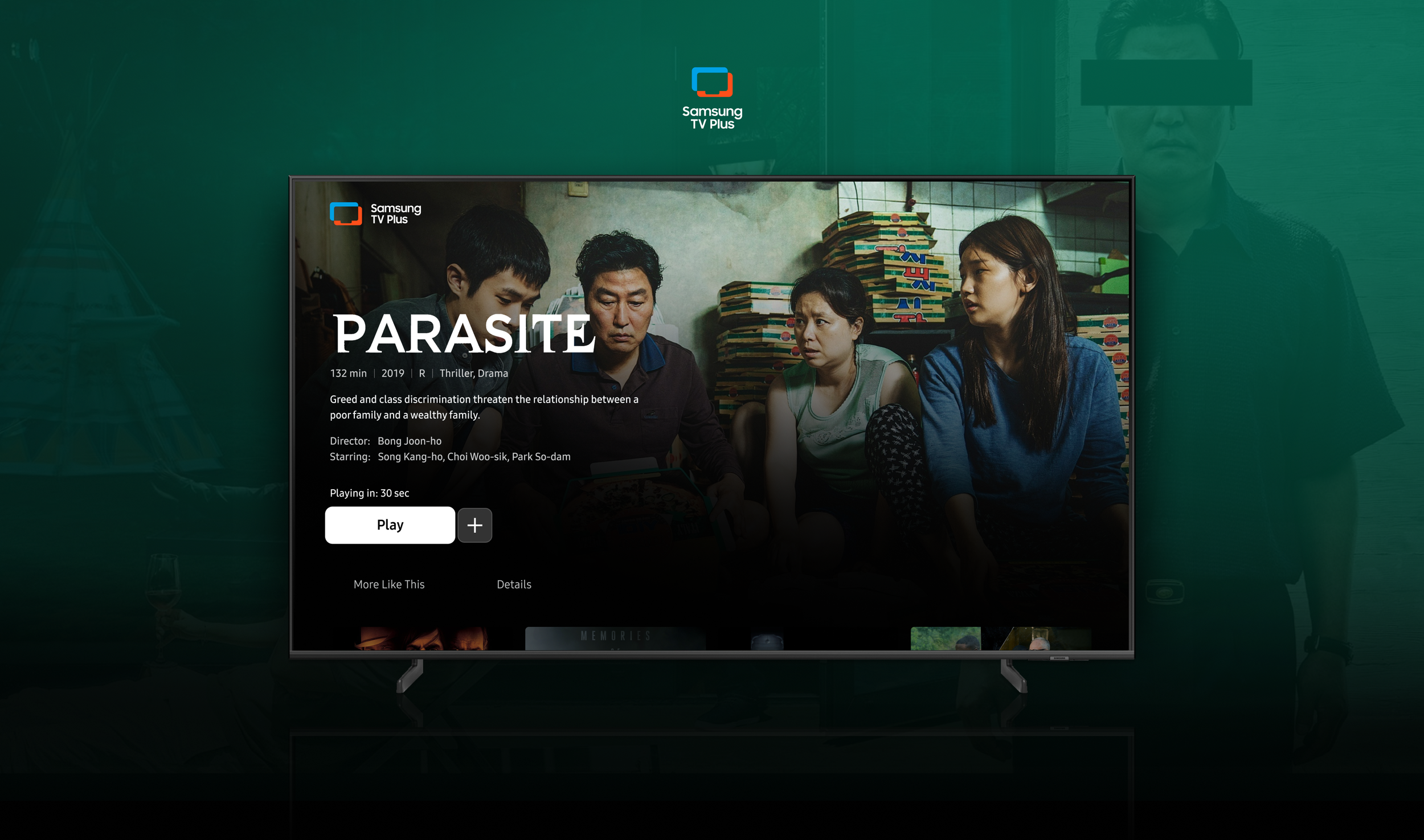
After
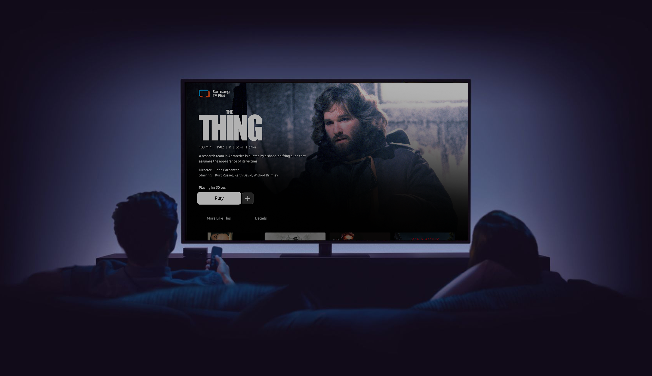
We wanted to make the experience feel more premium, so I reevaluated the assets we have available and how they could be better used. It was important to look at the information hierarchy and focus on the more important decision factors for users. I wanted to push the boundaries of our app structure by creating a page where the background video is not visible, and the user’s focus can be made the priority.
New immersive background image
Utilizing title logos
Reduced the description character count
Added second-level tab structure
Reduced top-level metadata to the new Details Tab
Movie Redesign Second Level
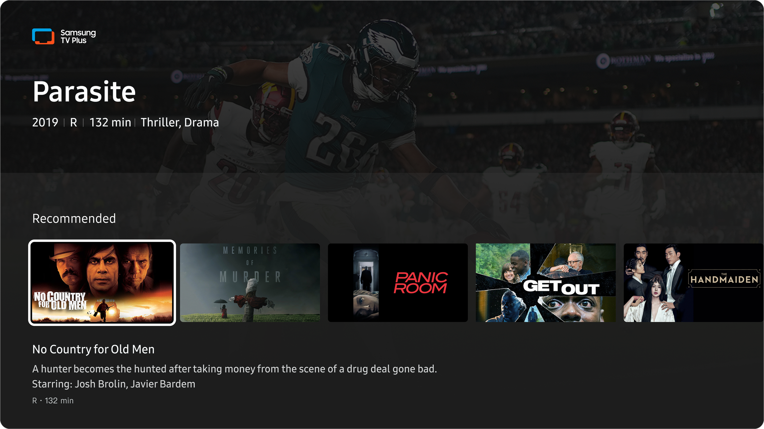
Before
A major thing users seek is related content to what they are watching or already enjoy. Before, this was only a row on the second level. The pain point was that with this component, only the singularly focused tile has metadata available to read. This makes it harder for users to scan for information. You are also relying on tile art that isn’t always clearly legible. When designing for TV, it’s important to keep in mind the standard 10ft distance between the user and the TV, so legibility is imperative.
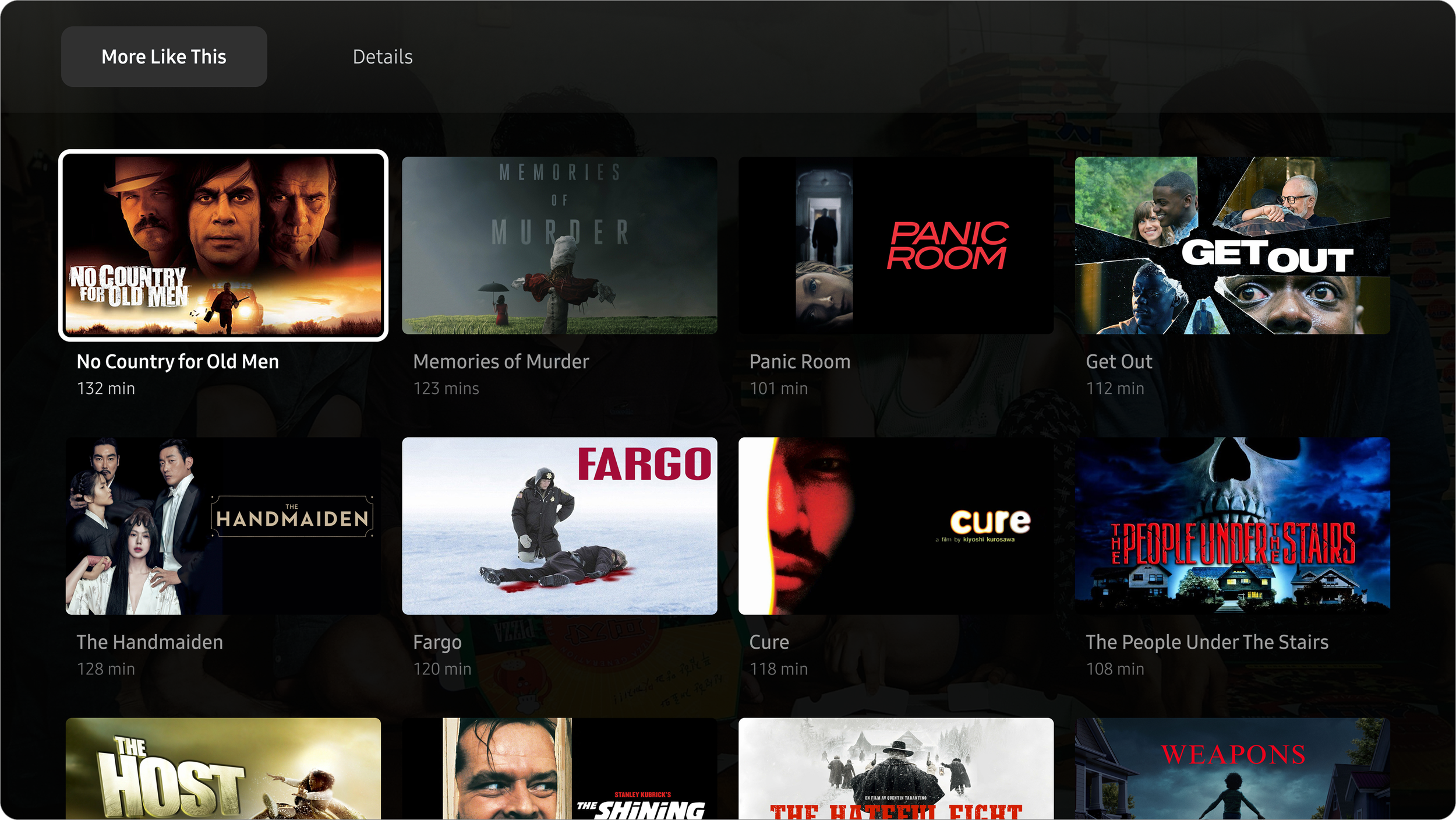
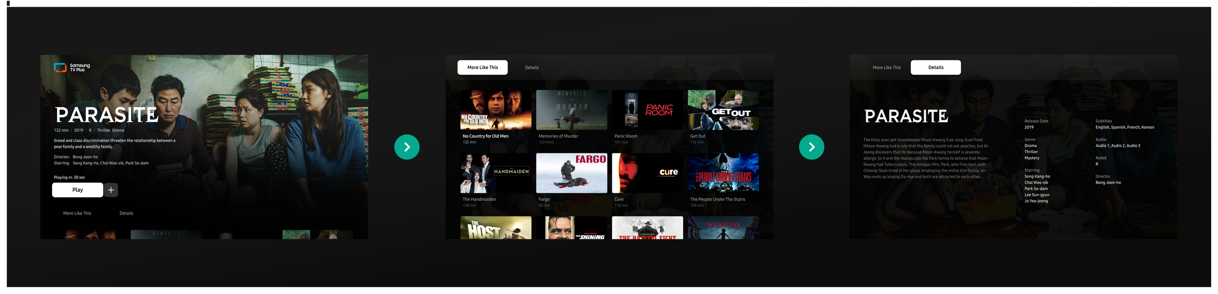
After
In the update, the More Like This Tab showcases related content in a grid view for better scanning, and now more options are viewable at once. I created a tab structure to organize the information that users want to look for. The tile size was increased, making better use of the space. If the user is in discovery mode, we want to make it as easy as possible for them to find what they're looking for.
TV Show Redesign
Before
The TV Show page has to host a lot of information, even for a program with only one season. The information can be spread out and still accessible. For instance, having the description of the series and the next episode on the same screen was overwhelming.
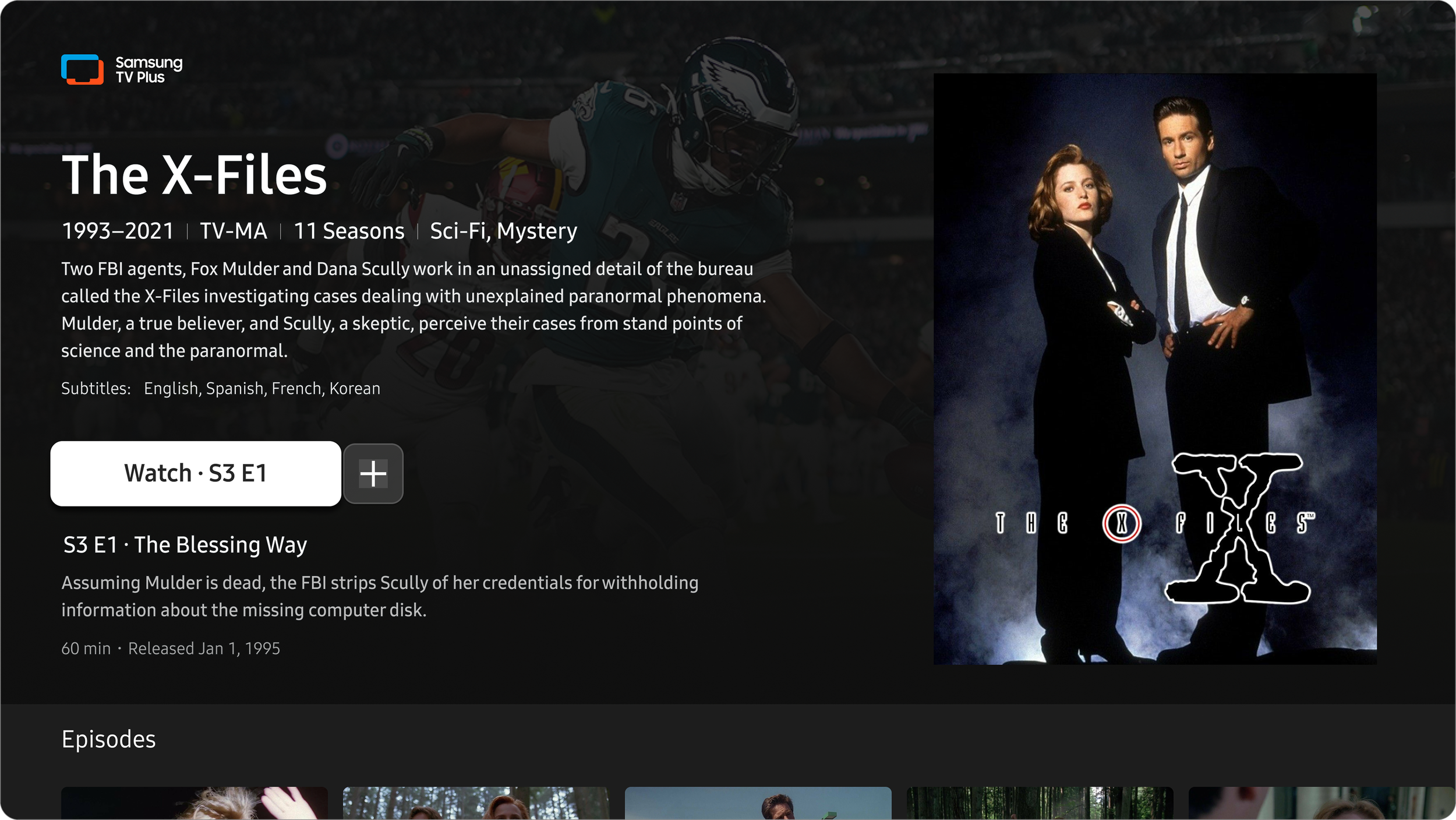
After
By moving information down to the tabs, it really clears up the page and allows the assets to speak and the most important information to let the user decide what they watch. The background image now covers the linear channel, lightening the cognitive load.
TV Show Redesign Second Level
Before
Just like the row on the Movies page, it only has one focused tile with metadata available. This can create a frustrating experience, having to scroll to each individual tile to find out more information. I wanted to remove any friction.

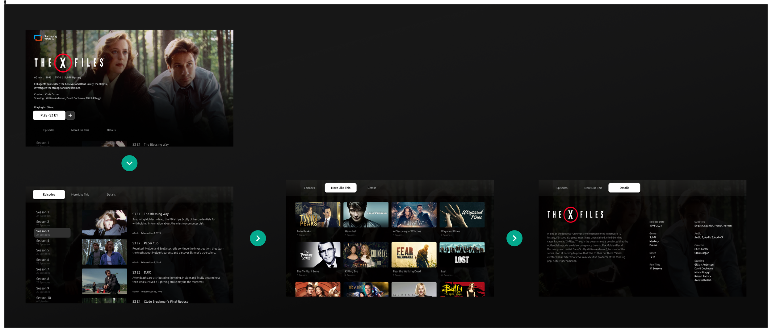
After
The new page has an additional tab for users to navigate to the season and episode of their choice. This list structure is now one long list; the user can scroll the long list, where previously the content stopped between seasons.
User Testing Sessions
We included these updates in our upcoming user testing session. I created all of the flows and assets needed to have this feature built into the prototype. I worked with our Research Lead to plan different methods the user could use to discover the content.
The testing was very helpful for finding out what information is most important to the users. Things like actors and directors that people recognize help inform them if they will enjoy the content. This confirmed our choices to move certain metadata down to the Details Tab.
Movie Tour
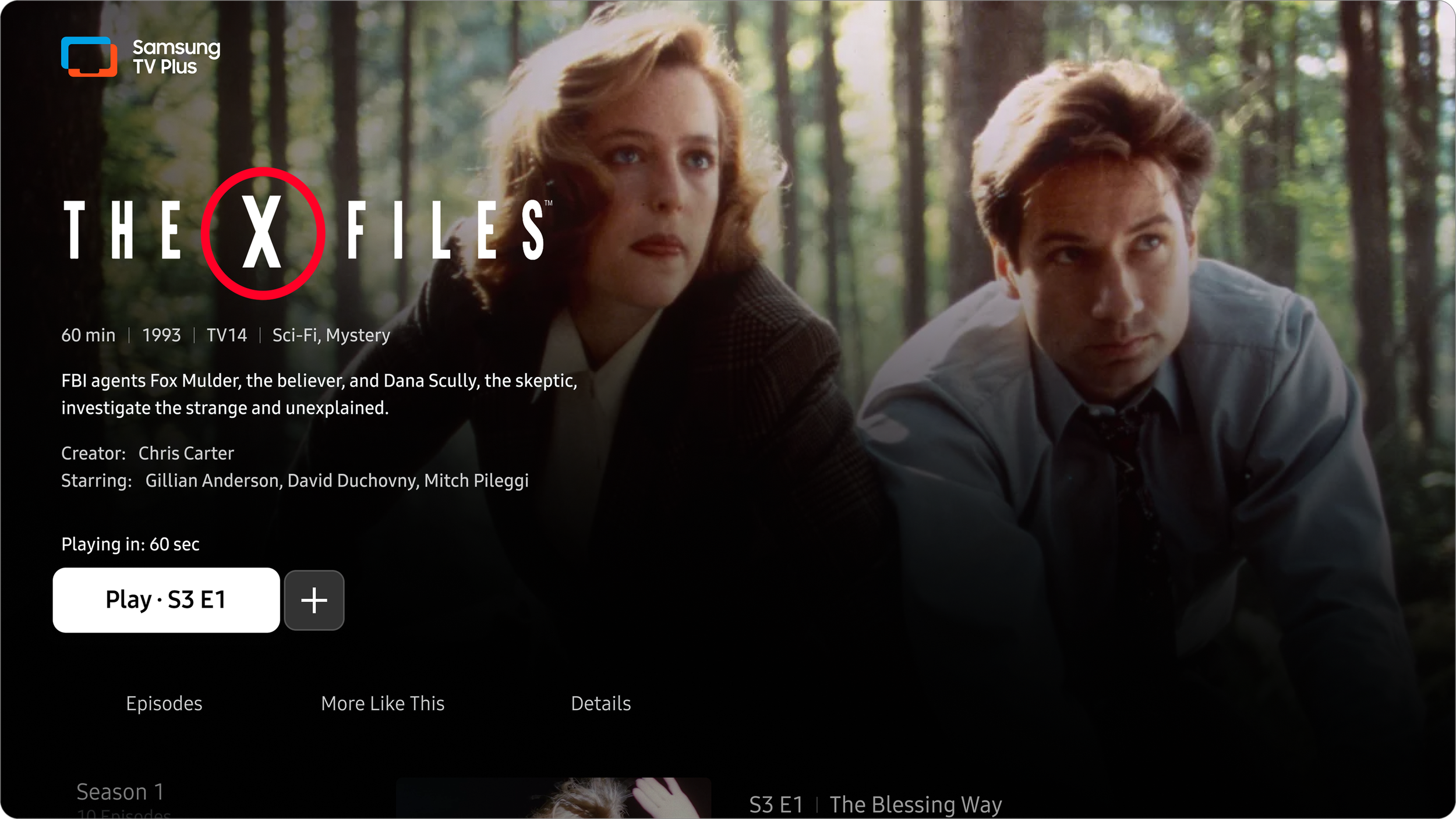
Here you will see a walkthrough of the navigation for a Movie content details page. The video is a screen recording of a prototype I created in Figma!
In the video, you will see that the users’ navigation history is saved between tabs. So if they scroll down the page and use the [Back] button to move the focus up to the other tabs, when they come back to the tab, they can resume exploring where they left off.
TV Show Tour
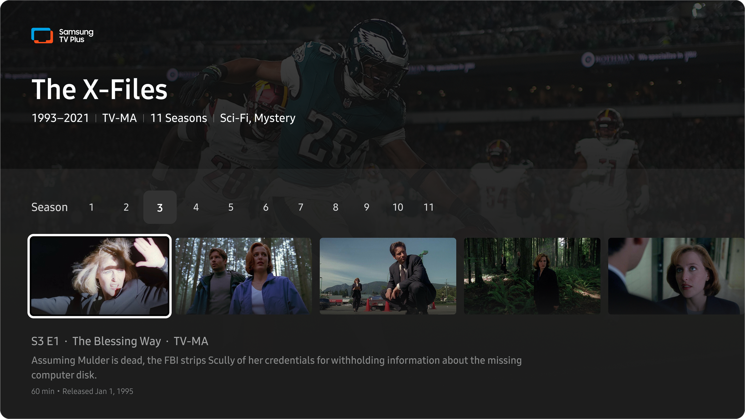
Here you will see a walkthrough of the navigation for a TV Show content details page. The video is a screen recording of a prototype I created in Figma!
In the video, you can see how the season and episode list component works. The season tabs act like anchor links to quickly get the user to where they want to be. I wanted the amount of information for the series to be digestible at a glance. So I added things like the number of episodes in the season as text underneath the tab.
Tabs Back Flow
Each tile is selectable and links the user to the content details page for that program. When a user continues to explore new pages but wants to go back, we save the history of where they left off. To save the amount of [Back] button presses, we take the user to the top level of each page, saving them time. The prototype here demonstrates that flow.
Being a streaming service user, I always rely on the [Back] button to navigate through the app. After sitting in on dozens of user testing sessions, I noticed that almost all users rely on this approach, so the back button behavior is essential for keeping the users grounded.
This often means bringing the user back to exactly where they came from.
Matching Components
The content that appears in our new tab comes from the same source as the More Like This row in the drawer of the movie player. So we wanted to align the components as close as possible.
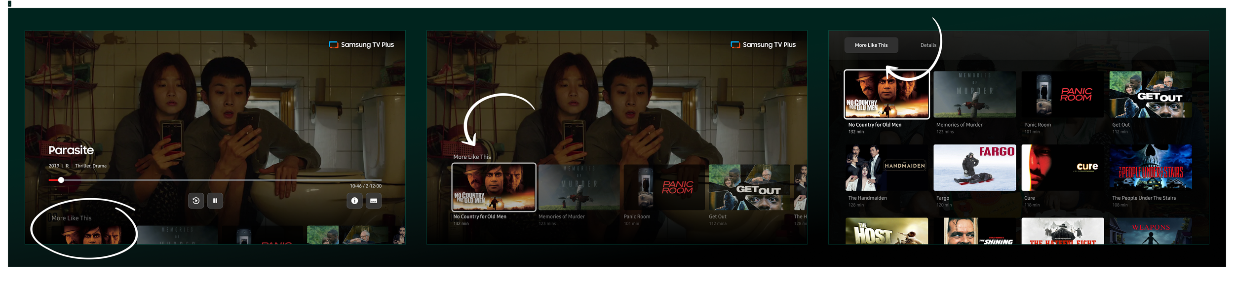
Movie Player
More Like This Drawer
More Like This Tab
While watching a TV show, there is a season and episode drawer to switch the episode you’re watching. We wanted to align the components as close as possible, but I also made some improvements to the navigation. Like making it one long list.
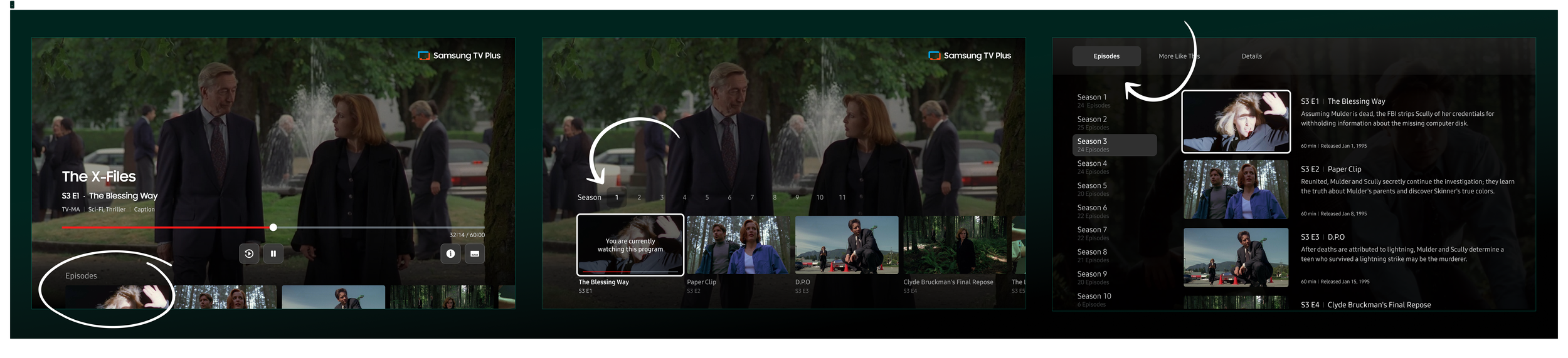
TV Show Player
TV Show Player Episode Drawer
TV Show Player Episode Tab
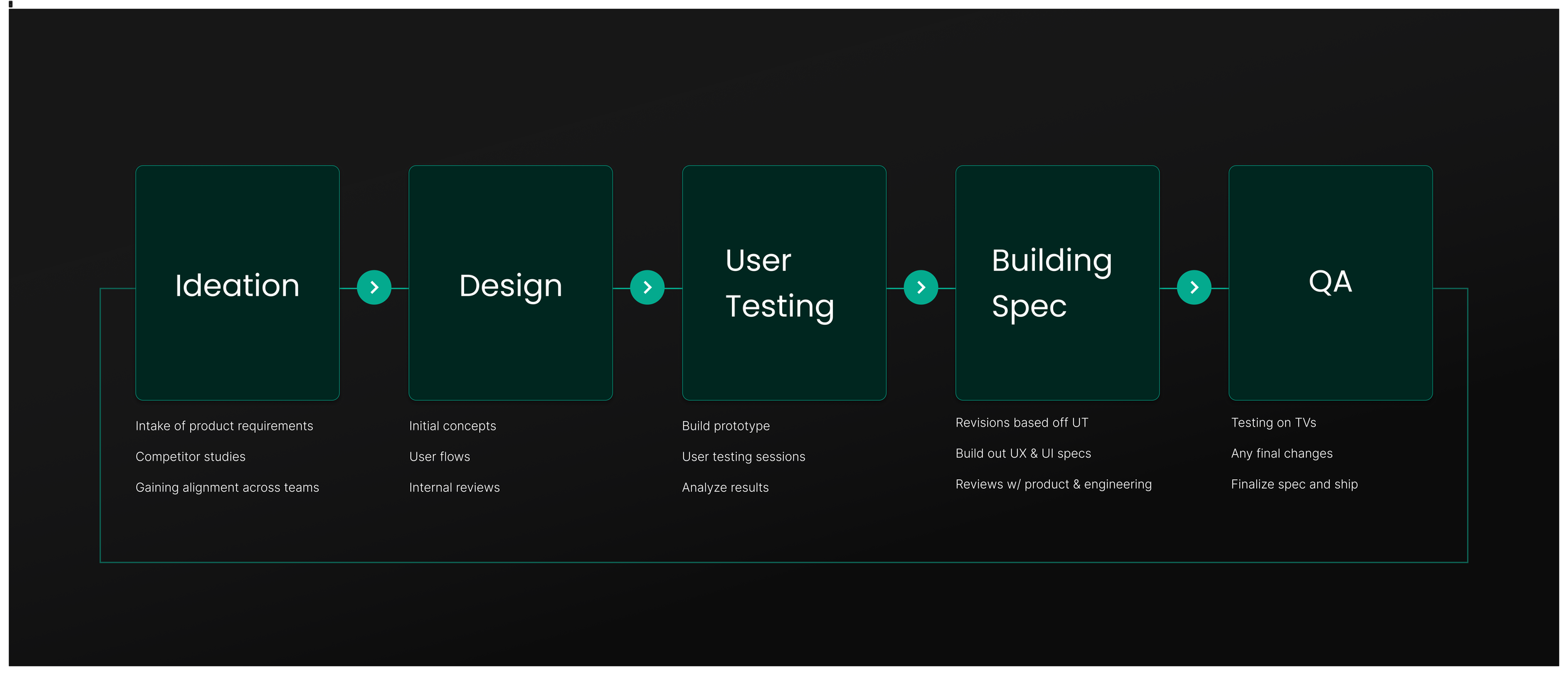
Execution
It’s one task to design a beautiful interface, but it’s a whole other mountain to make the template replicable for the variety of assets you have. This template has to work for all levels of quality of assets and the information you have.
Here is the breakdown of how we make those assets work in favor of the platform.
Metadata
Each piece of metadata must be organized in a digestible format based on the hierarchy of relevance to the user. In the user testing sessions, we asked participants what information was most important to them when browsing.
Having the logos for movies and shows is great for bringing delight factors and individuality to the pages. The quality control of different-sized logos and how they fit the template ratio provides a lot of challenges. It is good to have fallback options using text and setting the max character counts of that to ensure a consistently reliable experience.
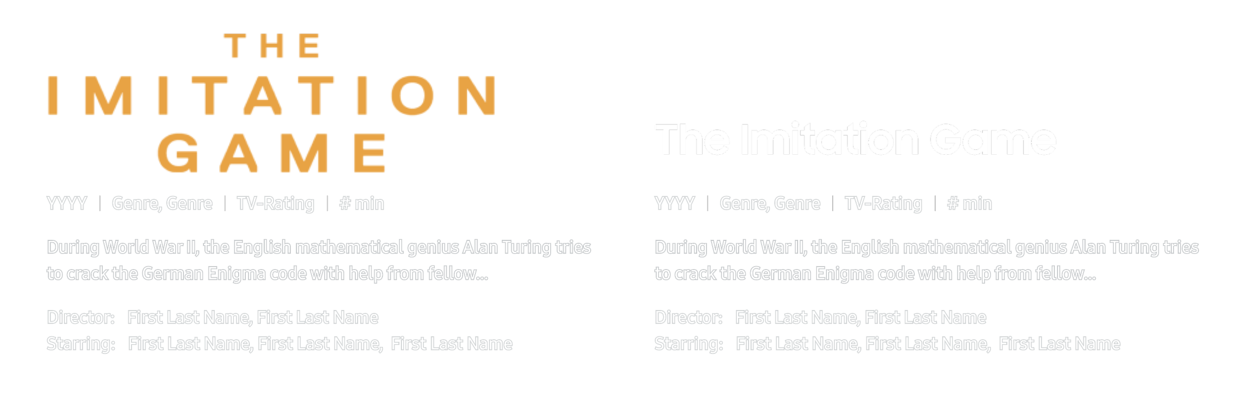
Here we have the logo and the fallback text for a missing logo case.
Sourcing the perfect image
We utilize an entertainment media distribution service called Gracenote, which hosts all of the metadata and image assets for all of our content. That’s everything from descriptions to episode titles to background images. Each movie or show has an ID that powers all of the different information to our backend.
As robust as the service is, we are limited to the assets they have, and it’s important to use the proper images in the proper contexts.
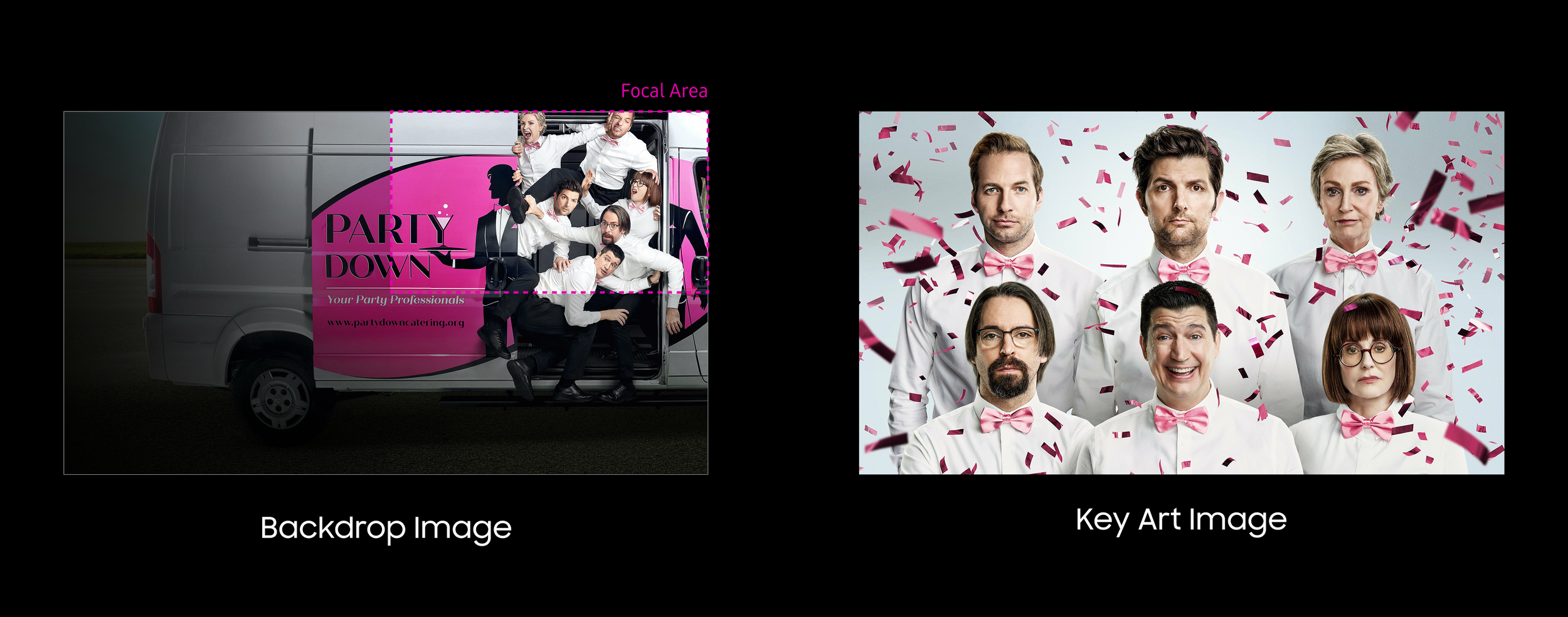
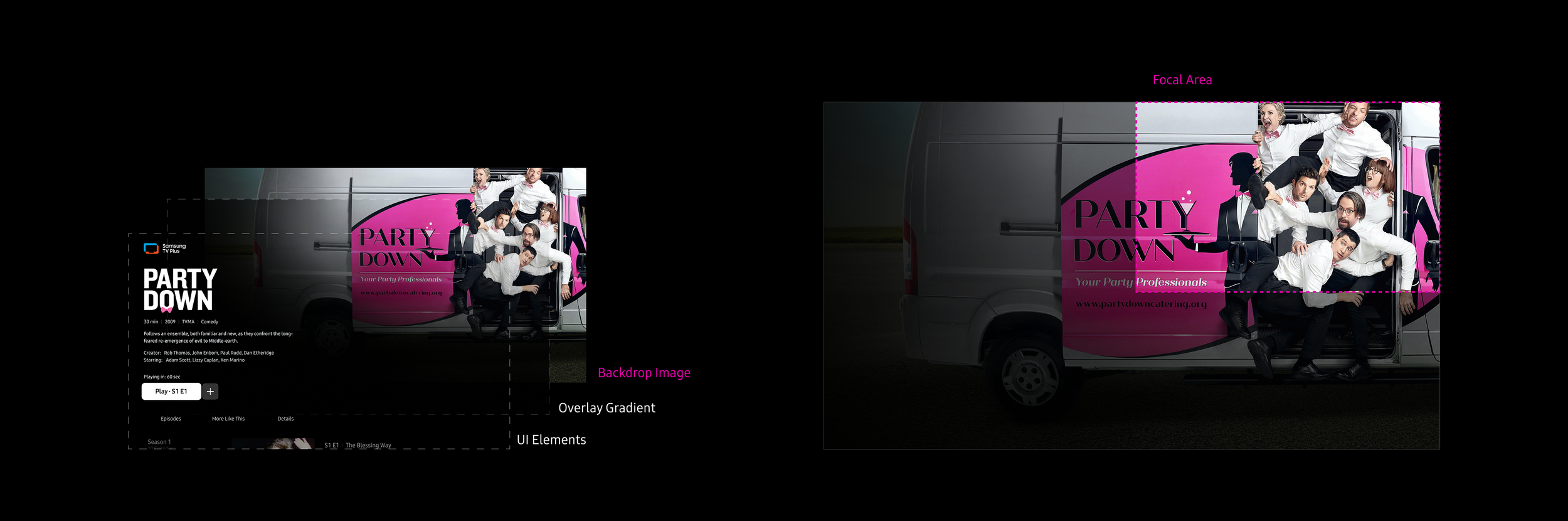
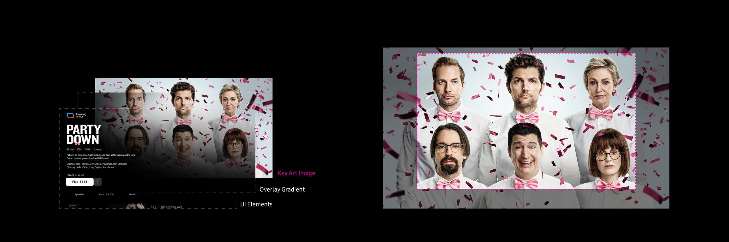
Each movie or show has many configurations of text and textless images, but only two image options work for our background images.
The Backdrop Image focuses the key content and/or characters in the upper right focal area of the image.
The Key Art Image has the key content and/or characters in the center of the image.
Adapting to changing designs
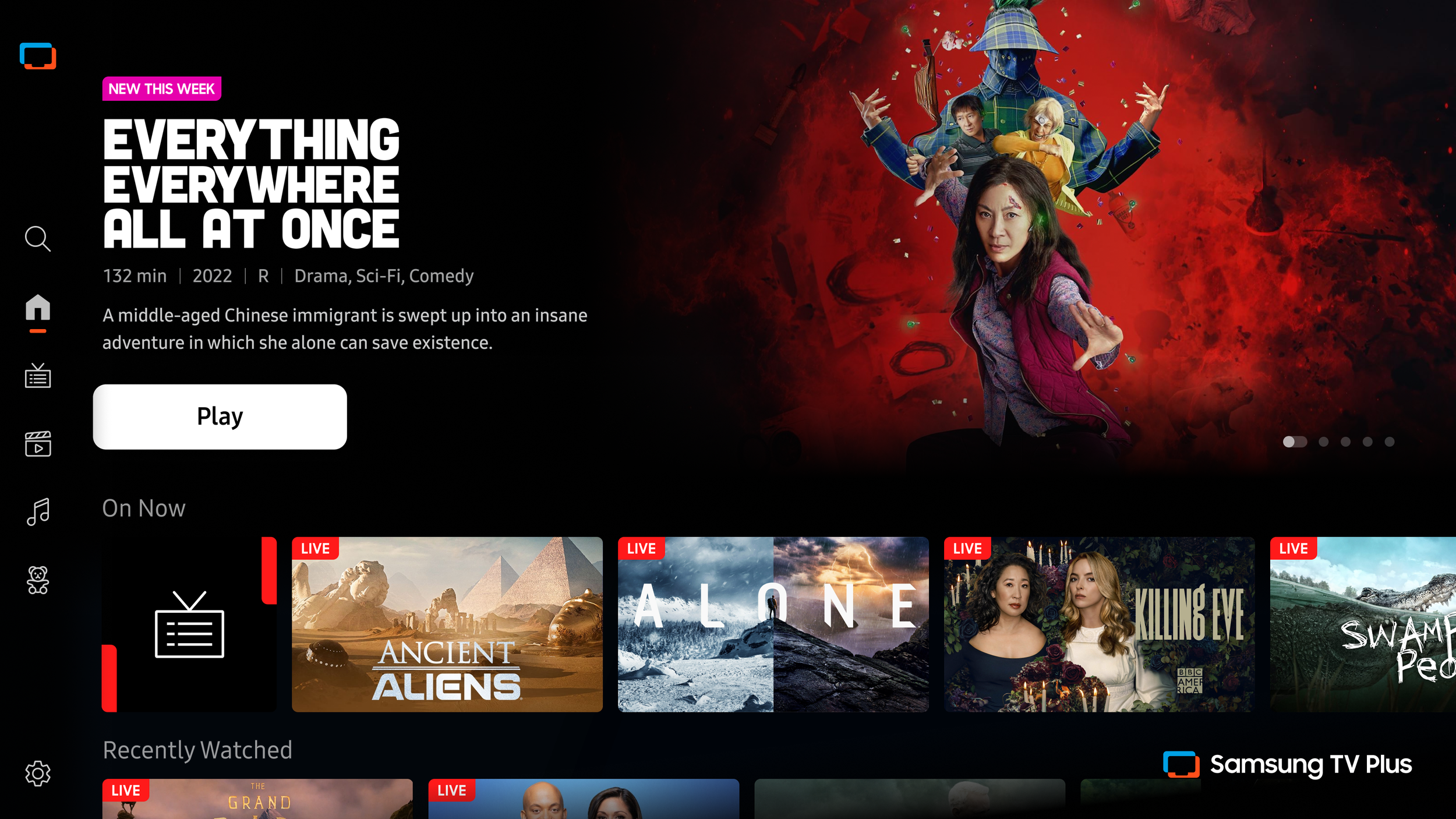
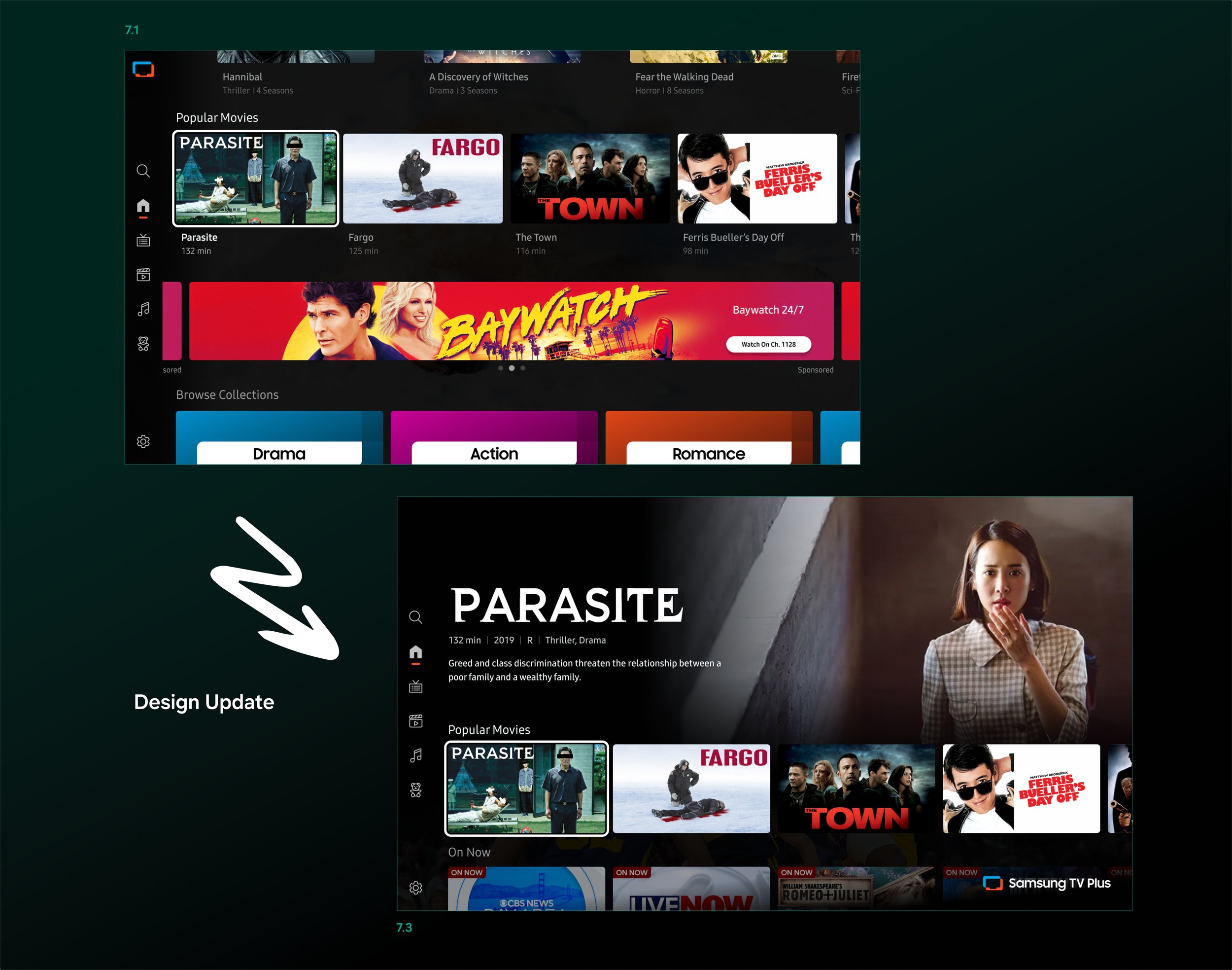
Our layout for the UI is actually best fitting for the Backdrop Image, but when we initially launched the redesign of the content details pages, our home browse experience was different.
Our home page did not have a hero area with an additional image and metadata. It was solely a grid of rows of tiles. So, for our content details layout, the Backdrop Image was best suited because the focal point of the image is in the open area, and the metadata doesn’t cover anything.
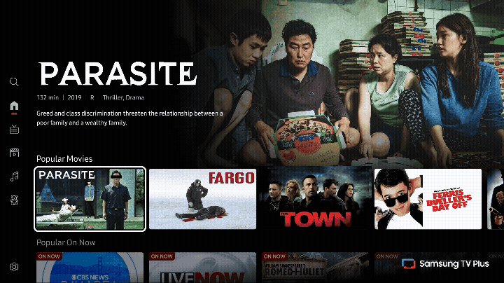
Then shortly after, we updated our browsing experience on the home page to have the fixed focus hero area you see on competitors. This layout calls for the Key Art Image centered image as the whole image is smaller in that space. The backdrop would look too empty. Now we needed to think about the transition. It has to be the same image, and the image will increase in size on selection.
Transition using the Backdrop Image
Transition using the Key Art Image
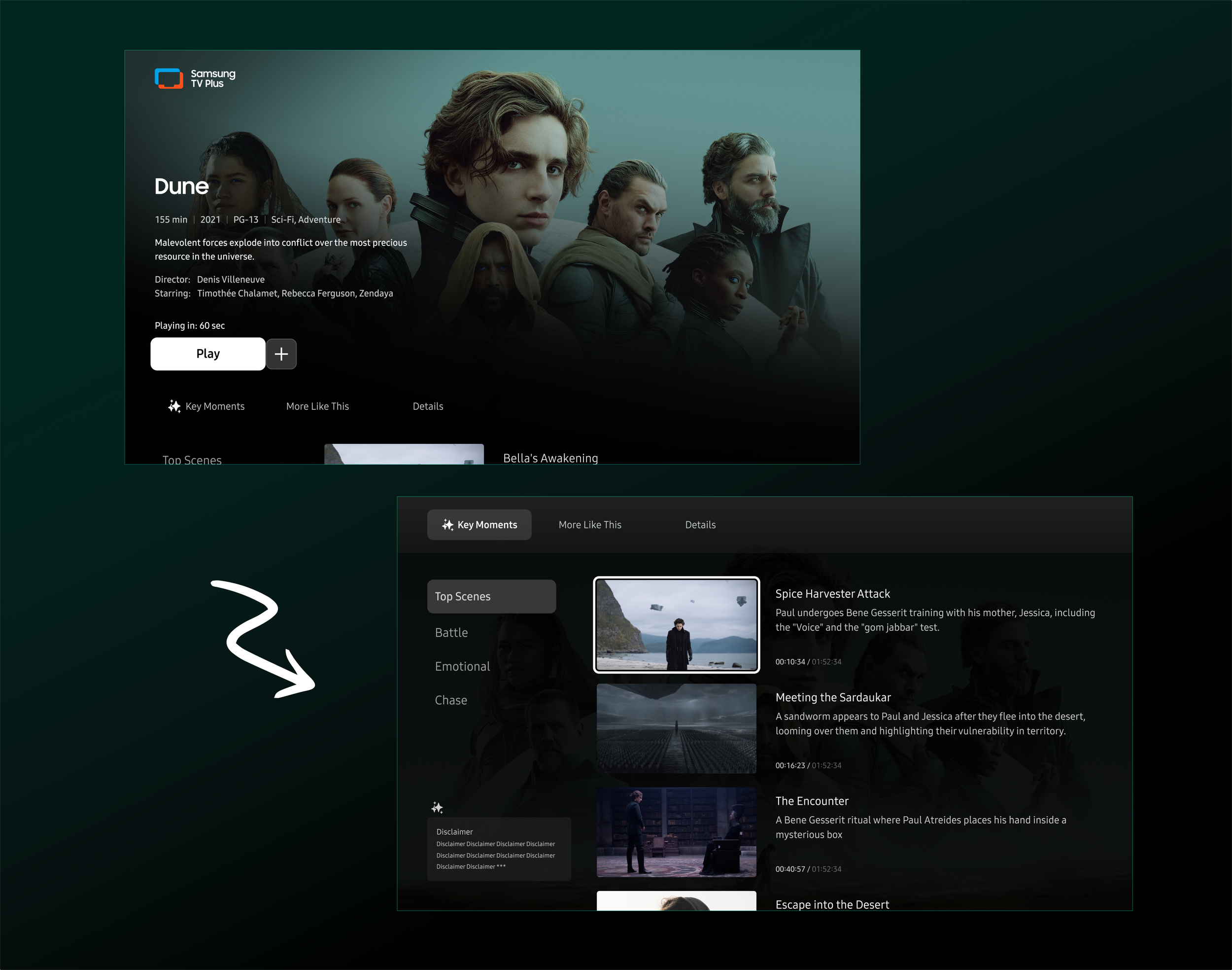
Adding new features
The tab structure approach worked out incredibly well for adding new features and assets. Another project I worked on was the Key Moments, a new feature where impactful scenes are time-stamped and selectable to jump in and watch.
We wanted to keep consistency across the pages, so we reutilized the season and episode components so the users were familiar with the navigation of a new feature.
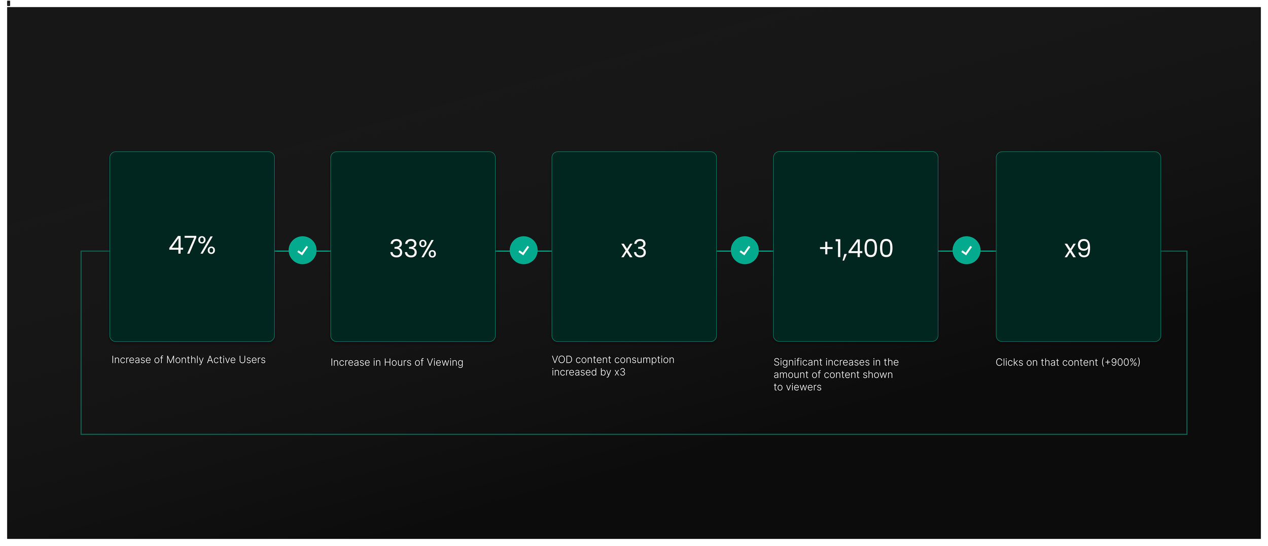
Reflection
After the launch of the redesign, our VOD engagement significantly increased and continues to grow. We enhanced the content discovery by offering rich visual content with reliable recommendations. I feel that we fulfilled the need to allow users to find more content they like and to properly showcase that content. The page is ever evolving and remains a keystone feature between the desire to seek out content and that bridge to playback.
This project was a great exercise in evaluating your resources and working through the proper channels to ensure that all points lead to the right place to ensure a consistent experience.