Theme Zero
Theme Zero is a multi-tenant streaming experience for 3rd party platforms — including iOS, Android, Web, 3rd Party 10-ft, and more — which offers a world-class aggregated entertainment experience, distributed across a variety of propositions.
My role on the project was leading the design of the Live Guide and Player features across all three platforms: TV, Mobile, and Web.
Theming
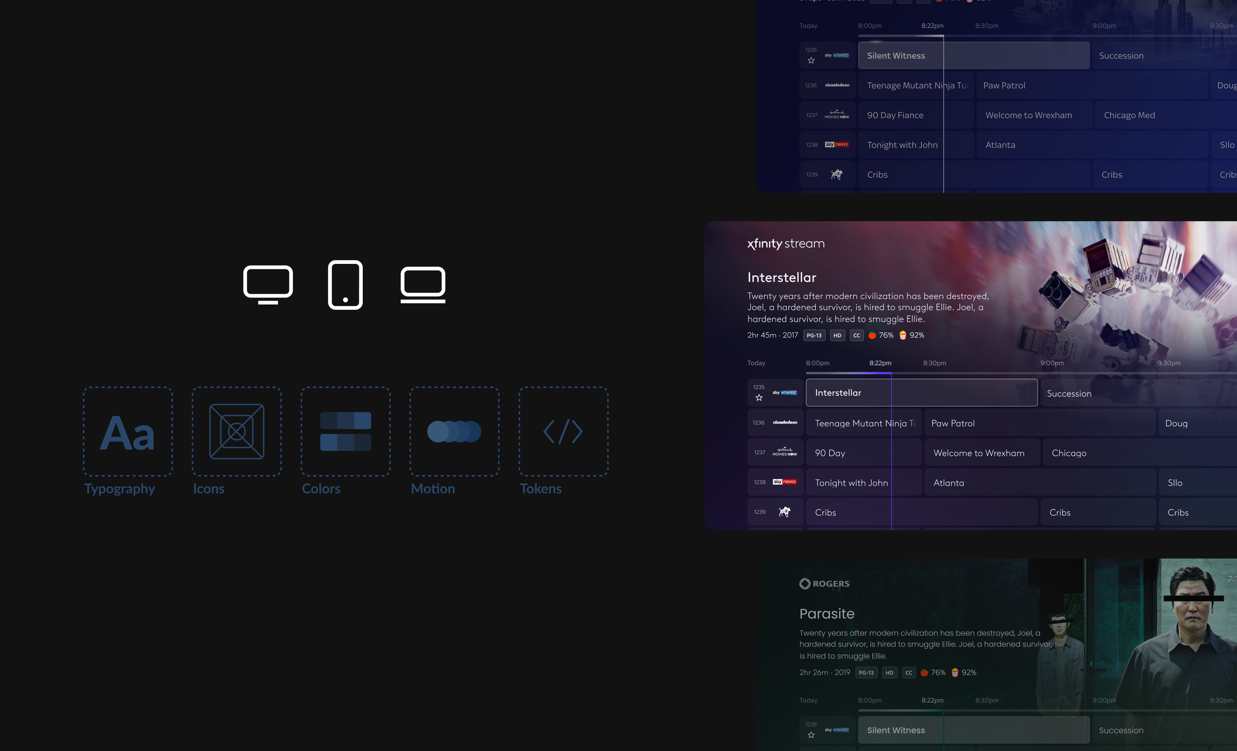
Theming allows us to deliver great customer experiences faster, with less engineering effort. It is a cross-platform approach to easily deliver cohesive, skin-able, and syndicate-able experiences for our products across TV, Web, and Mobile.
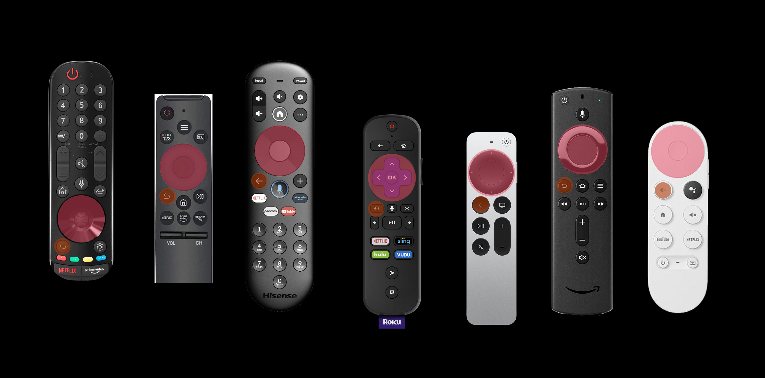
3rd Party Remotes
Remotes will vary, but all will have the D-pad, enter, and back button available. When available, experiences can take advantage of additional keys and provide accelerators to users.
Consistency Across Platforms
Consistency is one of the most important principles while creating a product across different platforms. While they maintain a family of products, the device-specific features are utilized to create the best user experience.
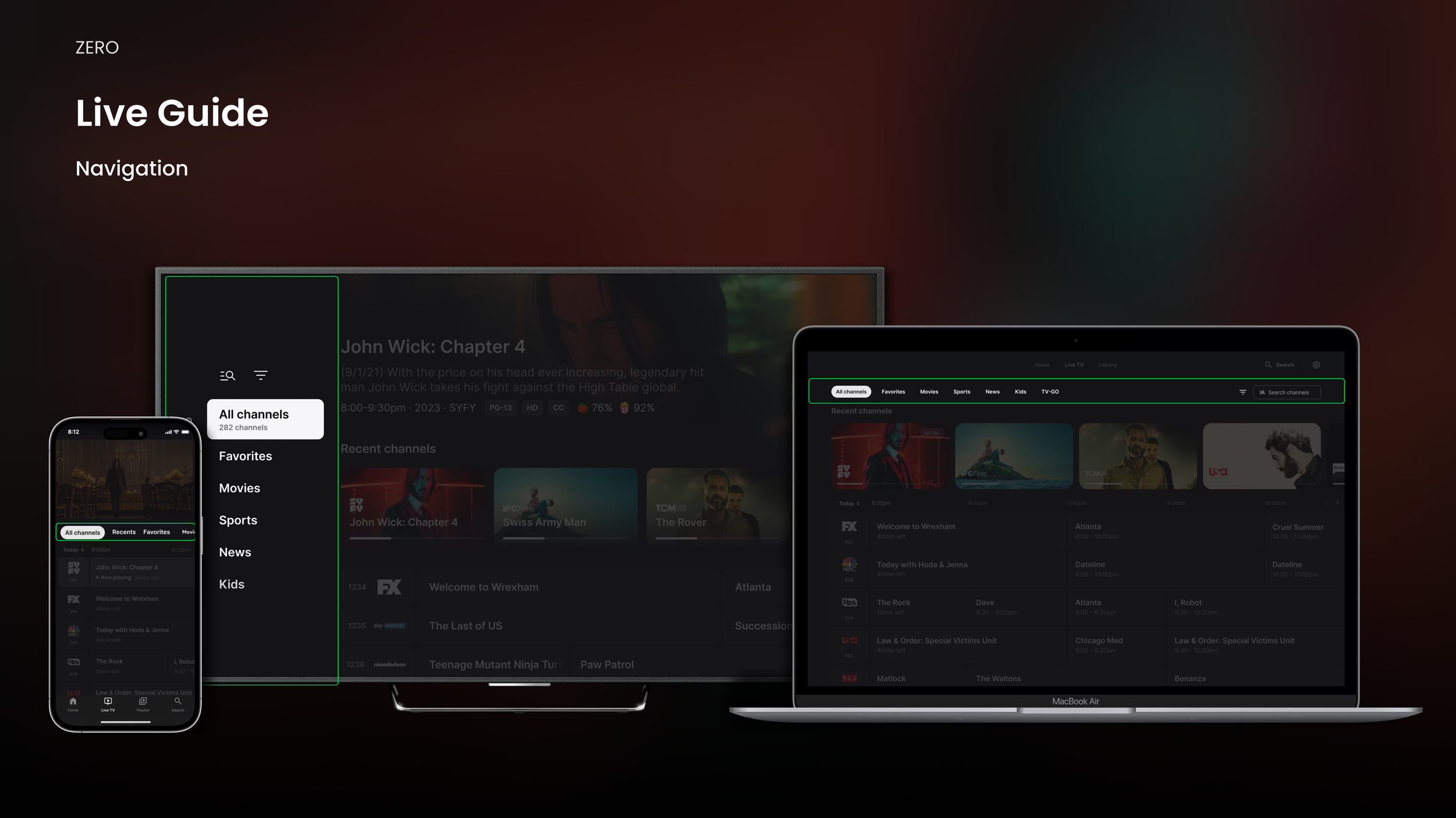
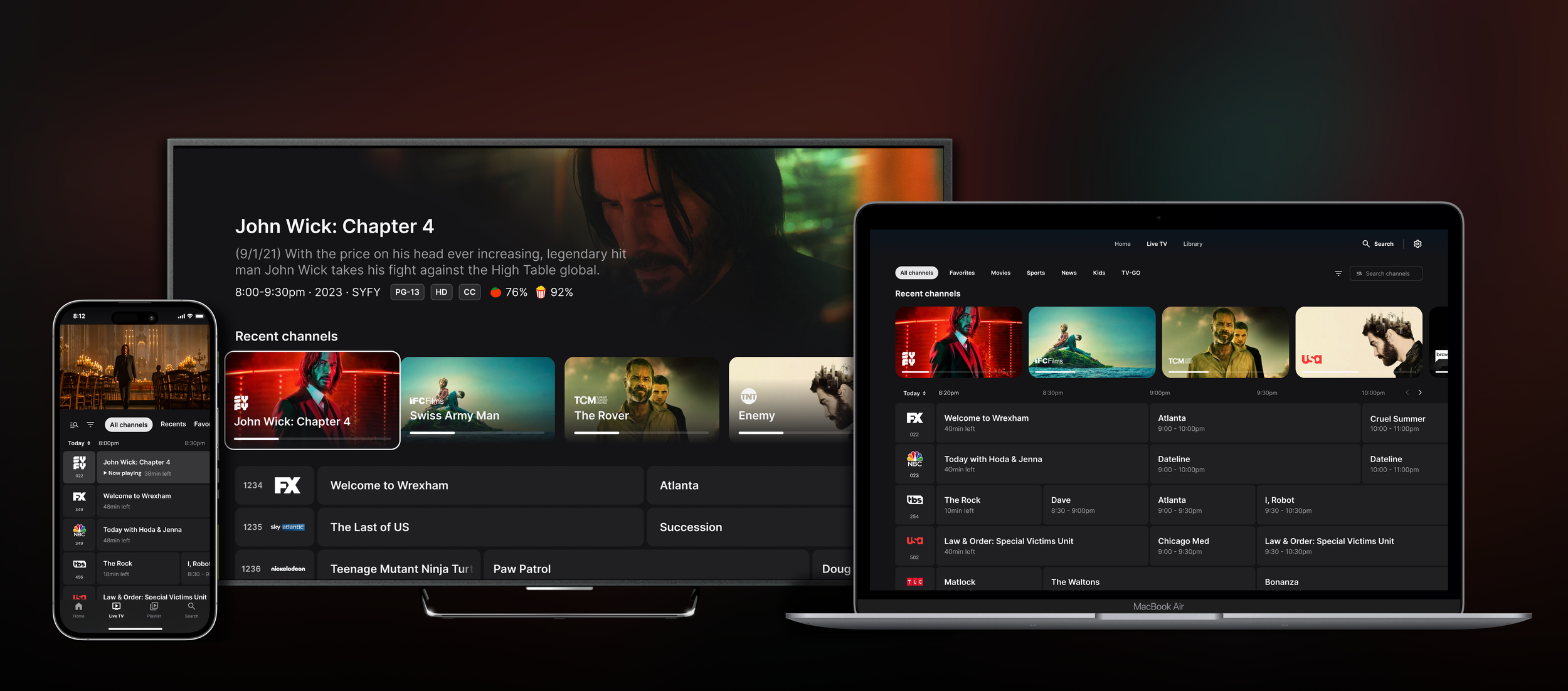
Navigation
All three platforms have a “local navigation” that is comprised of category filters that filter the grid by things like favorites and movies on now. The pattern is consistent on Web and Mobile, but for TV, we leveraged the side nav as it is the same pattern as the global navigation. It is also easier for the user to get in and out of the grid,
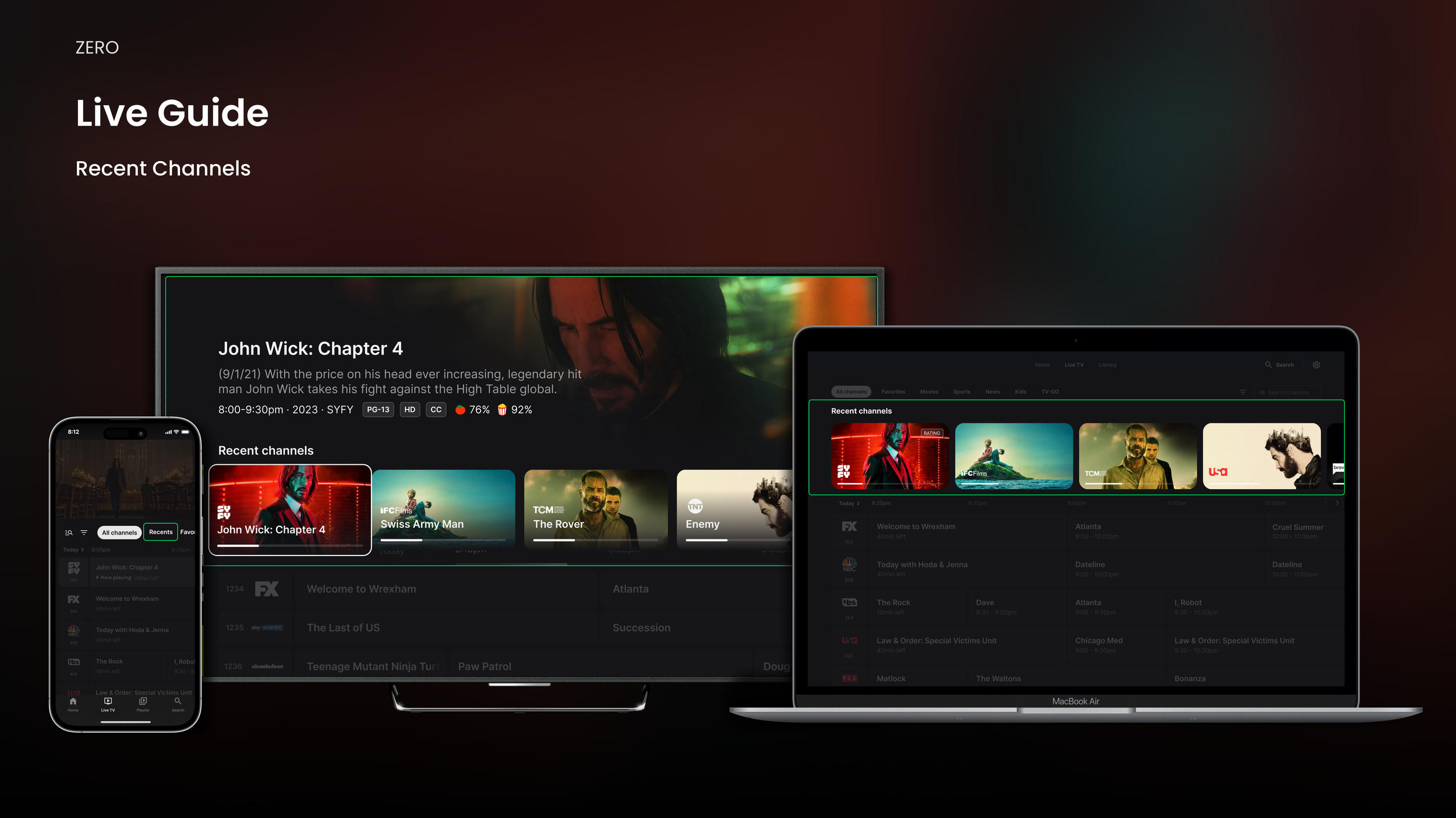
Recent Channels
Recent Channels is a fantastic feature that allows the user to access their most viewed channels for convenience and an efficient way to reach playback. On TV and Web, the feature is presented as a row of tiles that lives on top of the grid. Mobile had to deviate as we are leveraging live video at the top of the guide, so the feature has been moved to the second category filter.
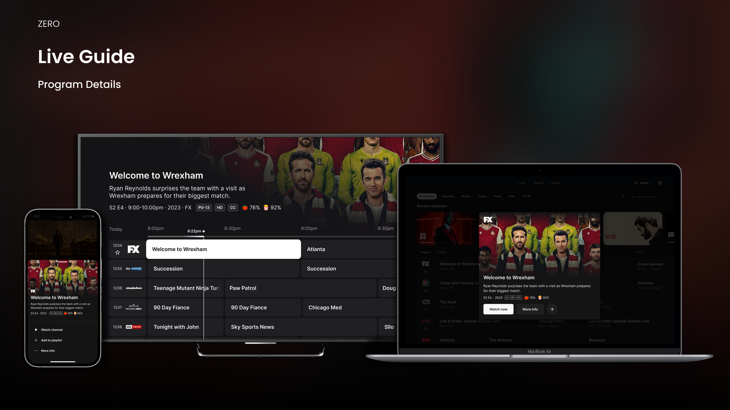
Program Details
Keeping it consistent for how program details and metadata is displayed became tricky. On TV, the user is always focused on something, and the related details are displayed in the hero content area at the top. For the Mobile experience, the native sheet pattern was utilized, and for Web, a modal overlay appears on click.
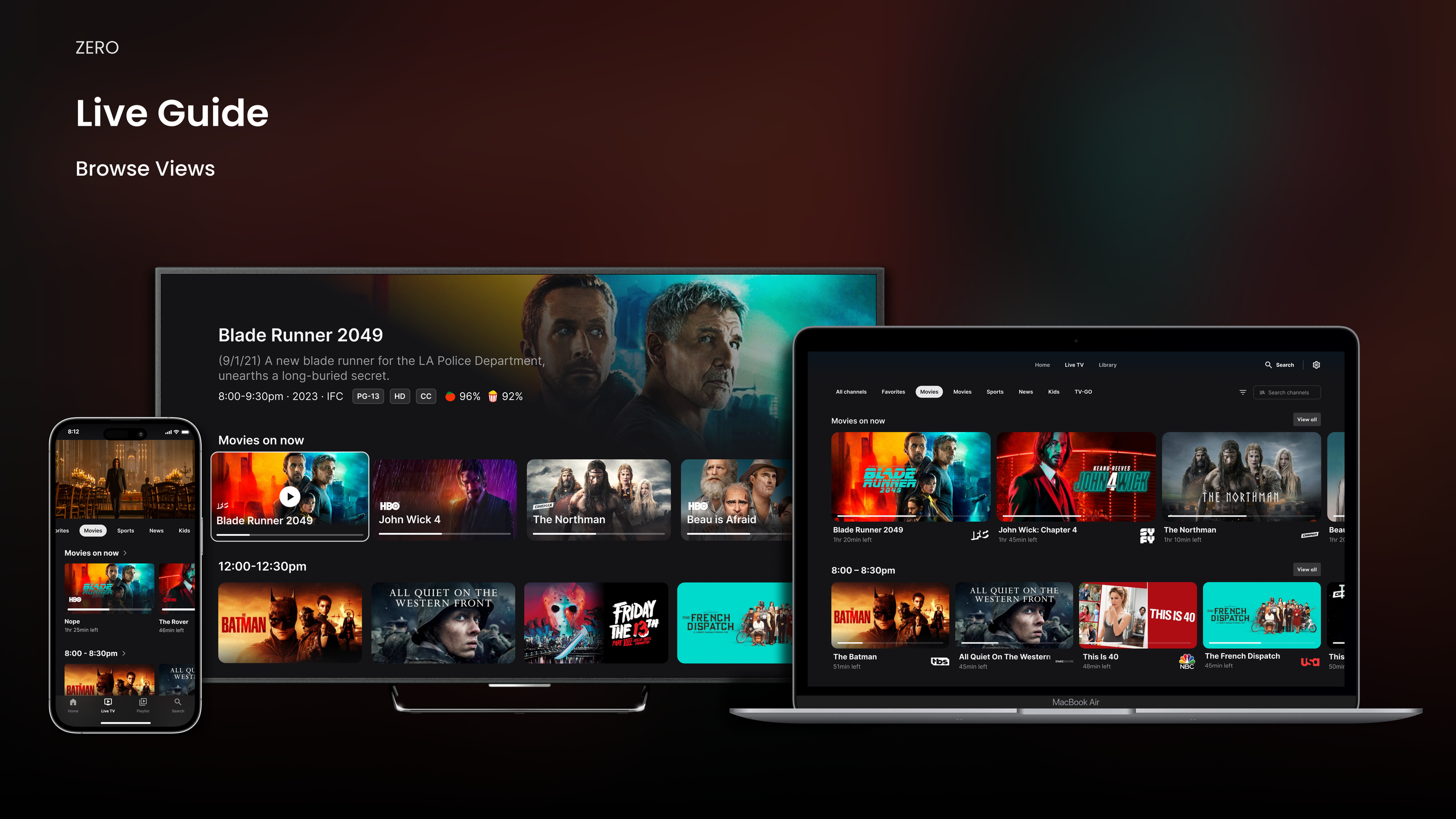
Browse Views
When a user selects any of the category filters, the live content on the guide is displayed as tiles instead of cells. This is utilizing the browse rows from other areas of the experience. Showcasing the programs in this way creates an engaging layout that improves the browsing experience.
TV Prototype
Consistency is one of the most important principles while creating a product across different platforms. While they maintain a family of products, the device-specific features are utilized to create the best user experience.
Mobile Prototype
Consistency is one of the most important principles while creating a product across different platforms. While they maintain a family of products, the device-specific features are utilized to create the best user experience.
Web Prototype
Consistency is one of the most important principles while creating a product across different platforms. While they maintain a family of products, the device-specific features are utilized to create the best user experience.