Reviving an Ancient Feature
While working at Samsung TV Plus, I have taken ownership of the Live TV feature and our efforts to redesign and improve it incrementally. This case study dives into the initial redesign, where we tested two different methodologies and built off the results.
What is the EPG?
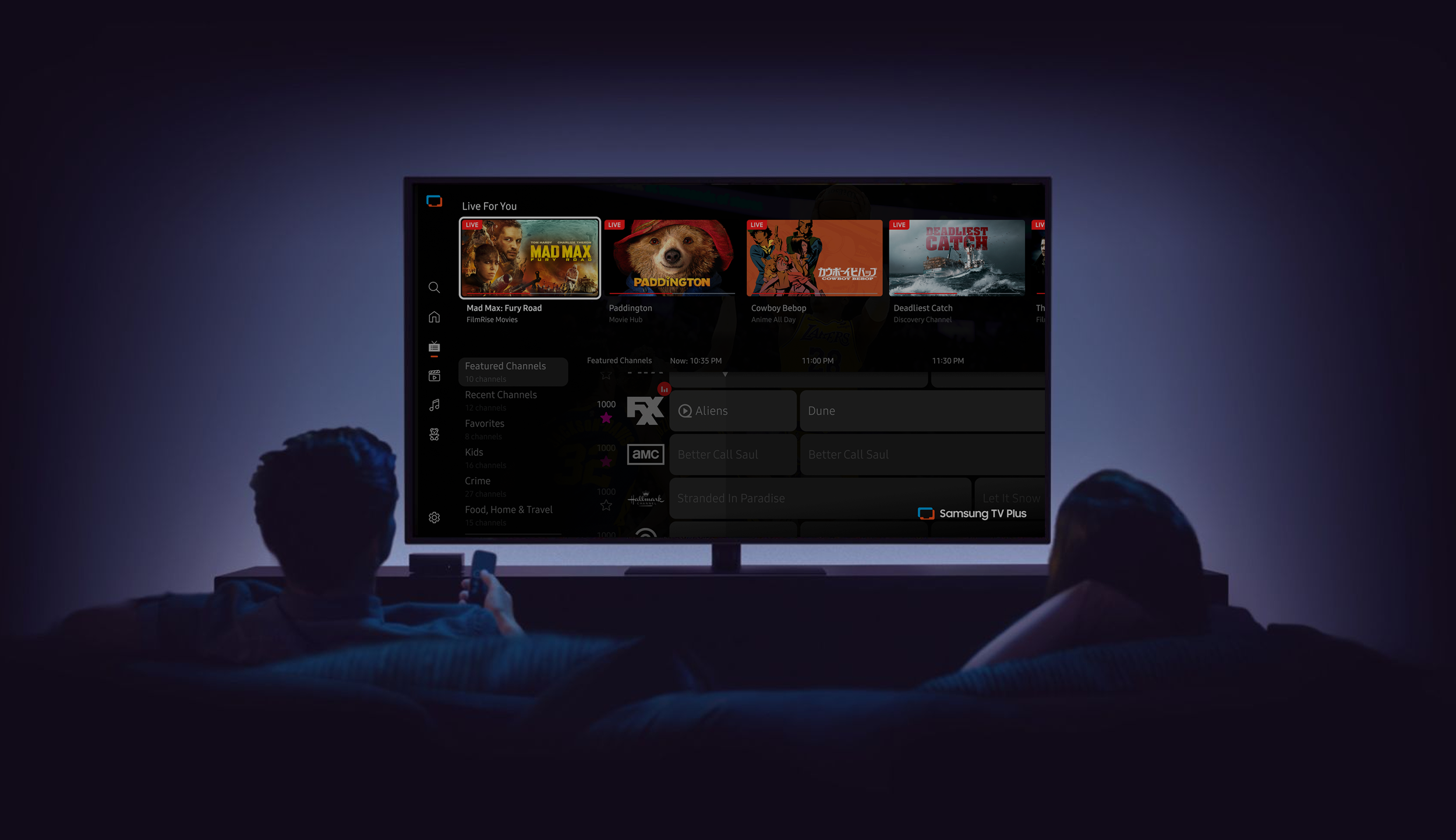
The Live TV page is also known as the EPG (Electronic Program Guide). This feature hosts schedules for linear channels and allows users to browse categorized content, favorite channels, and watch live TV.
The Objective
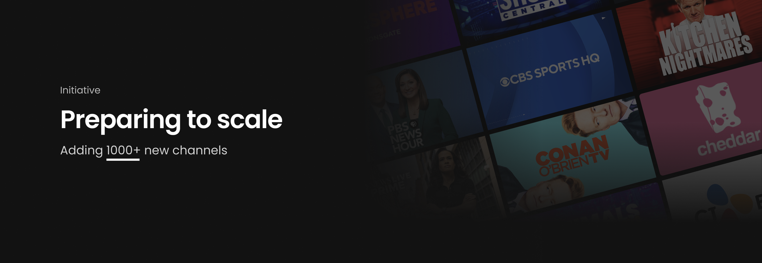
A new deal had been made to add over 1,000 channels to the already extensive Live TV page. Before these channels were onboarded, leadership wanted to ensure the best experience was in place. I wanted to address a handful of items. Those improvement areas were: grid & genre navigation, how information is displayed, and how much information is displayed.
The goal was to improve the EPGs’ usability, address friction, and increase engagement – all without altering the traditional linear TV experience that users of all generations are used to.
Business Goals:
Increase hours of viewing
Increase the number of linear users
Increase linear content usage through EPG
Success Metrics
Faster time to content from EPG entry
Higher engagement with live programming through EPG
Increased repeat usage
My Role
UX & UI
Designed the end-to-end experience from ideation to launch, as well as led the UX strategy.
Testing & Prototyping
Collaborated with our Research team and prototyper to build and test out these solutions.
Documentation & QA
Building the spec documents while working with Product and Engineering teams to ensure launch accuracy. I also contribute to the QA of the feature while it is on staging.
Now let’s turn back the clocks.
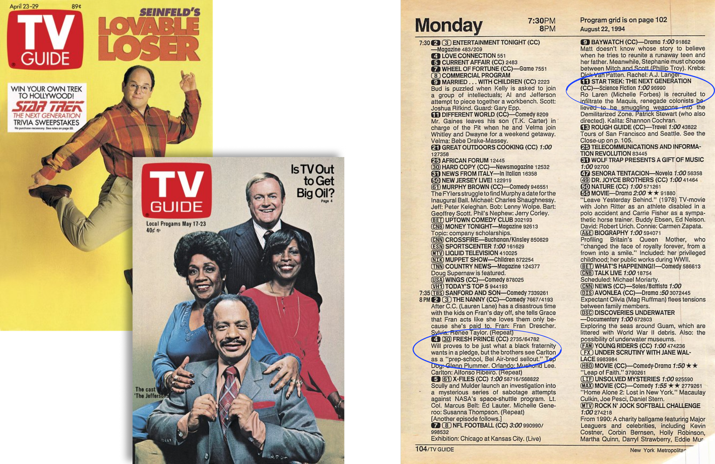
Where did the EPG originate?
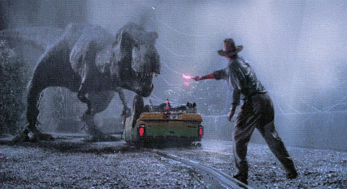
Before the age of cable boxes and streaming, there was the TV Guide.
The TV Guide was a weekly magazine that showcased all of the programs playing on each channel throughout the week.
It’s important to understand the history of how things came to be to make informed decisions for designing the next chapter.
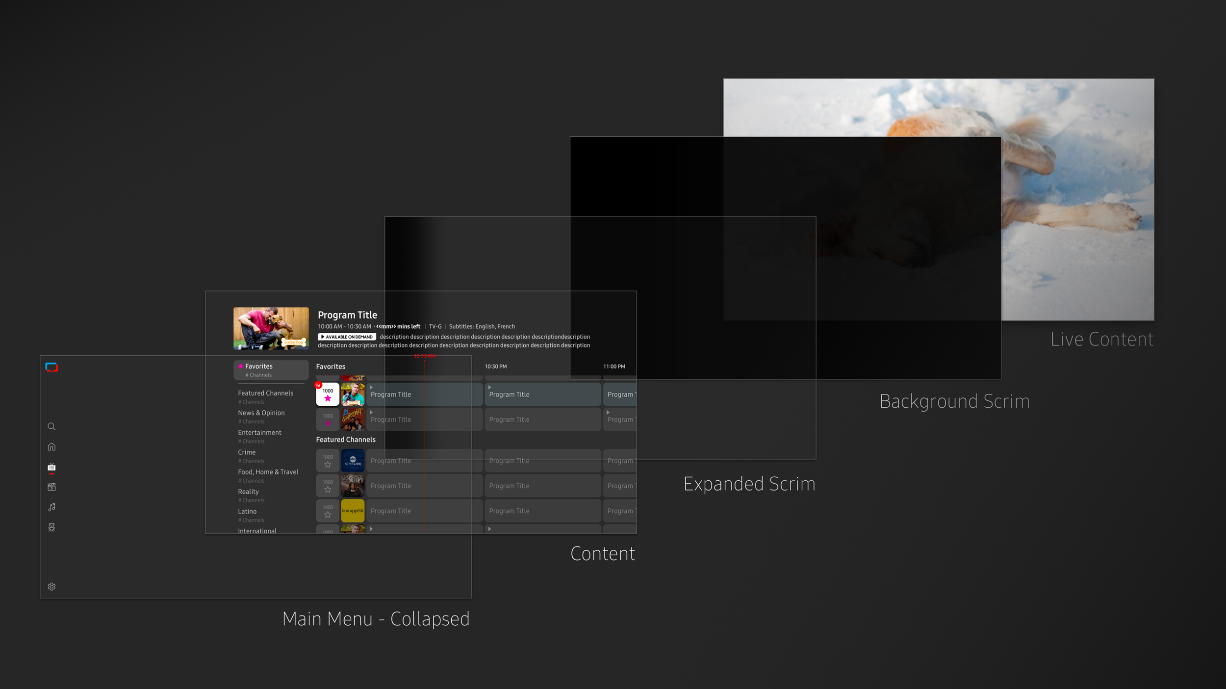
Live TV Anatomy
The feature has evolved from the early days, but it still has its roots in traditional television broadcasting.
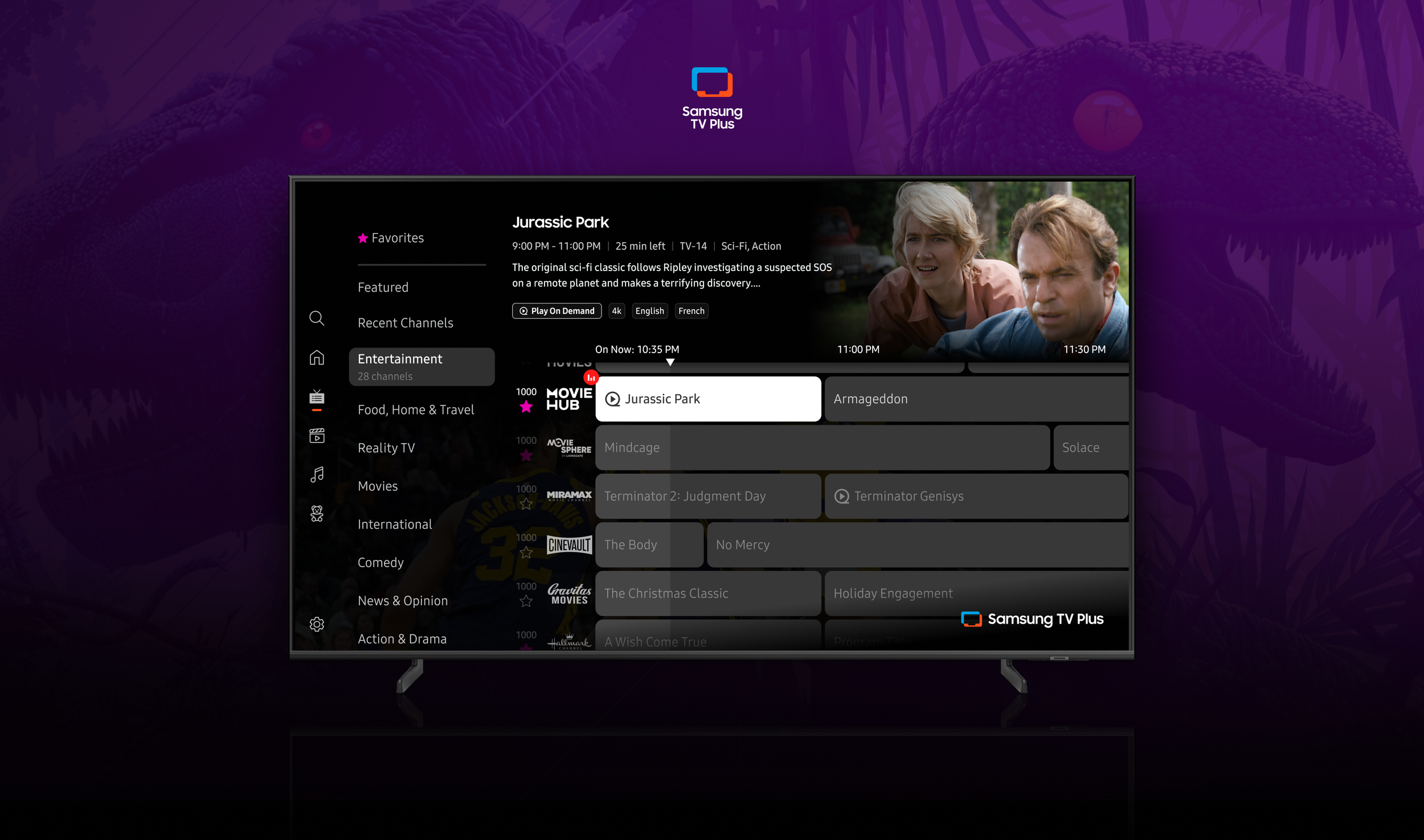
Our current EPG follows the traditional grid, where channels are displayed in rows categorized by genres. The grid is a timeline spanning left to right, and each channel hosts programs airing at different times.
A key thing to note is that there is always live TV playing in the background. So this adds a moving image underneath the scrim and audio to the overall cognitive load.
Problems with the current experience
Before these channels were onboarded, I wanted to address a handful of current UX problems. Those improvement areas were: grid & genre navigation, how information is displayed, and how much information is displayed. Those pain points are detailed below.
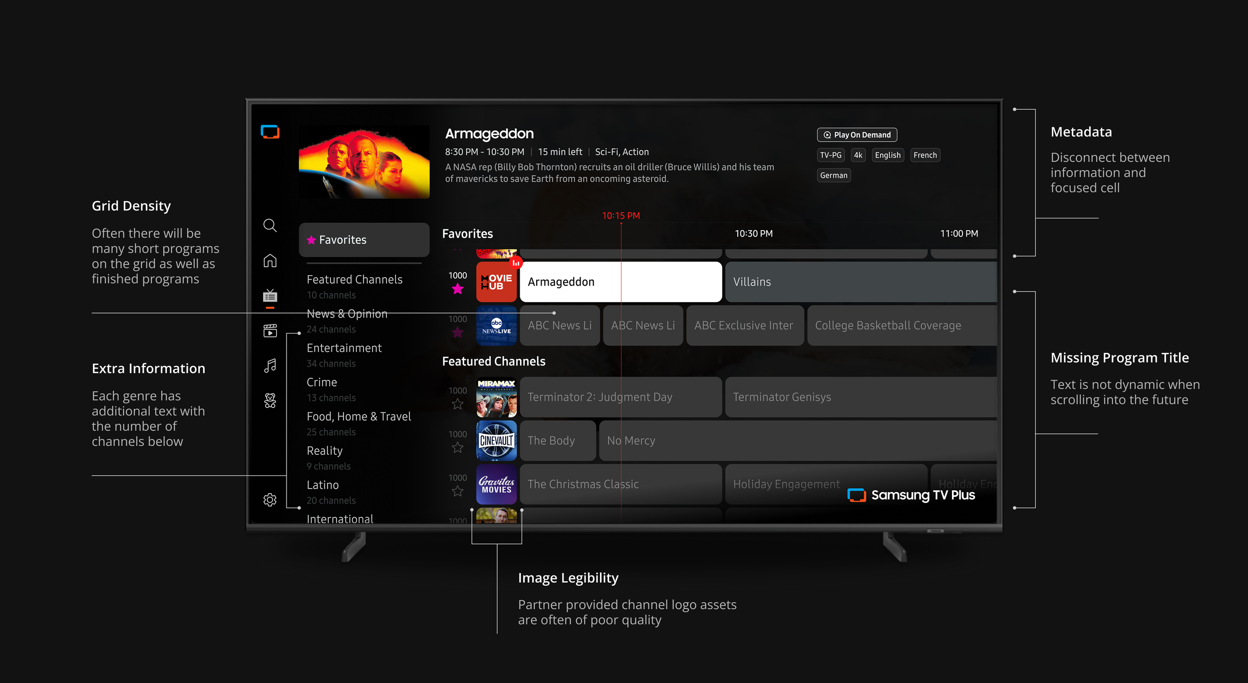
Technical backend issues are causing UX pain points
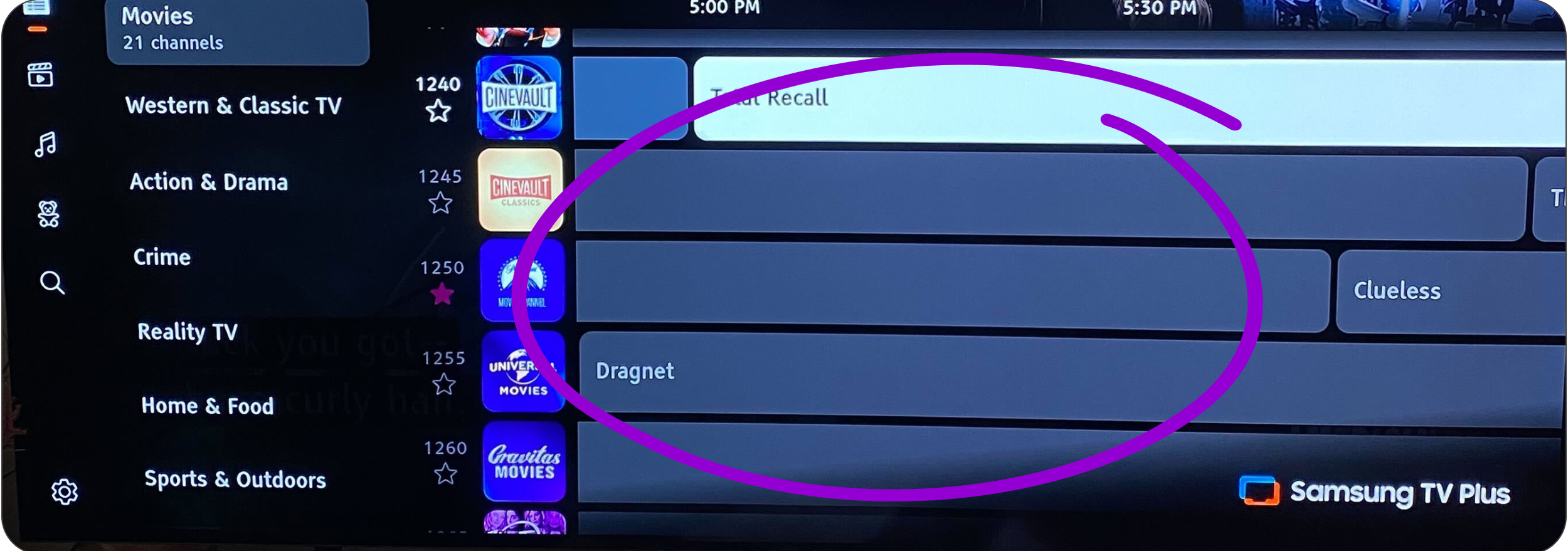
Dynamic Text
When the user moves focus into the future programs, the program text of long program cells does not dynamically move. This results in many instances of programs on screen without titles. Not knowing where your next move is a major concern.
Text Overflow
Very often, the program cells reach a width that can’t support the full title of the program, leading to the text overflow fallback of using ellipses. This is not good for scanability and discovery.
In addition to the visual and hierarchical problems, I wanted to use this opportunity to fix some long-standing backend issues. All three of these issues were related to grid navigation. Those pain points are detailed below.
Finished Programs
There is a current technical restraint that leaves finished programs on the grid until the page is refreshed. They are unselectable, causing frustration to the user and a disruption to the grid.
Hypothesis & Proposal
Data showed that users rarely navigate into the future programs. The current grid displays programs airing up to 7 days for each channel.
Knowing this presents an opportunity to put more focus on the live content the user can watch right now. As shown in the competitor study, there are a few streaming services that utilize a two-column “On Now” & “Up Next” grid.
The two-column grid approach could possibly solve all three technical backend issues mentioned in the above section.
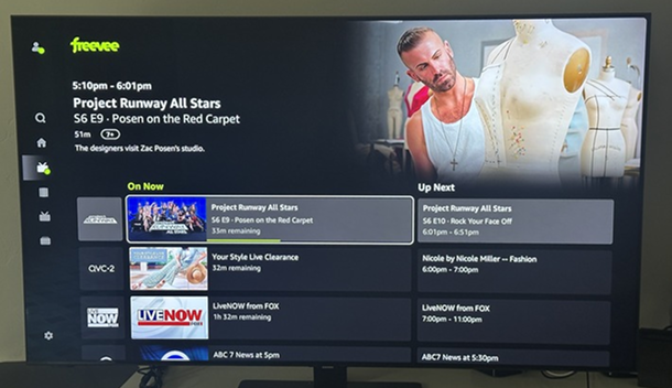
Competitors with two-column EPGs
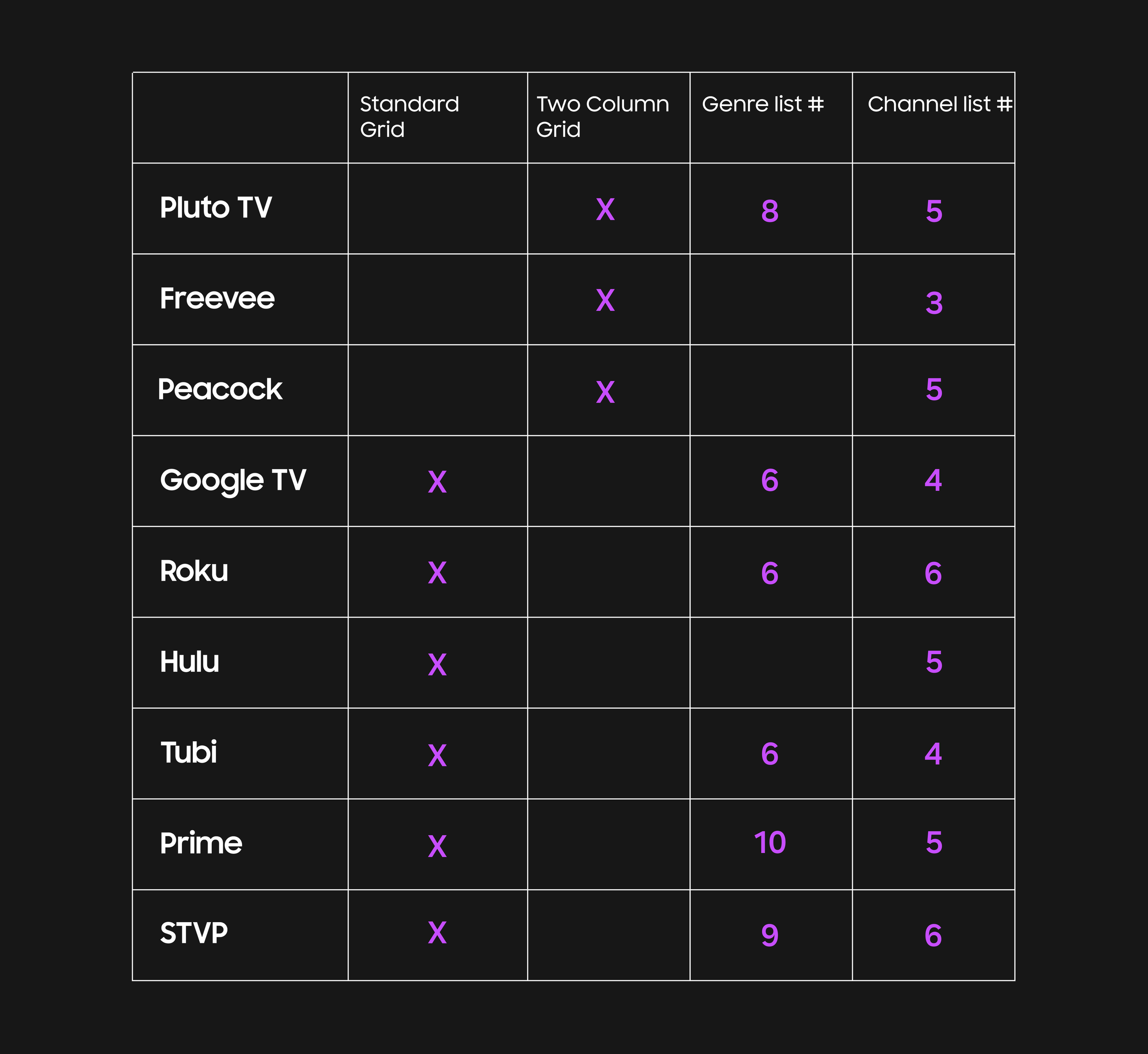
Freevee
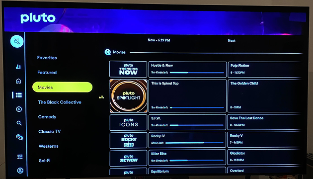
Pluto TV
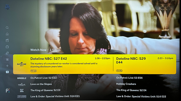
Peacock
Exploring a new model
The plan was to validate through testing whether the current standard grid was better or worse than the new two-column grid approach. Afterwards, we will refine the favored option and run another user testing session to address some other known issues.
I designed the new two-column grid, as well as giving our current grid some visual improvements to match the new styling.
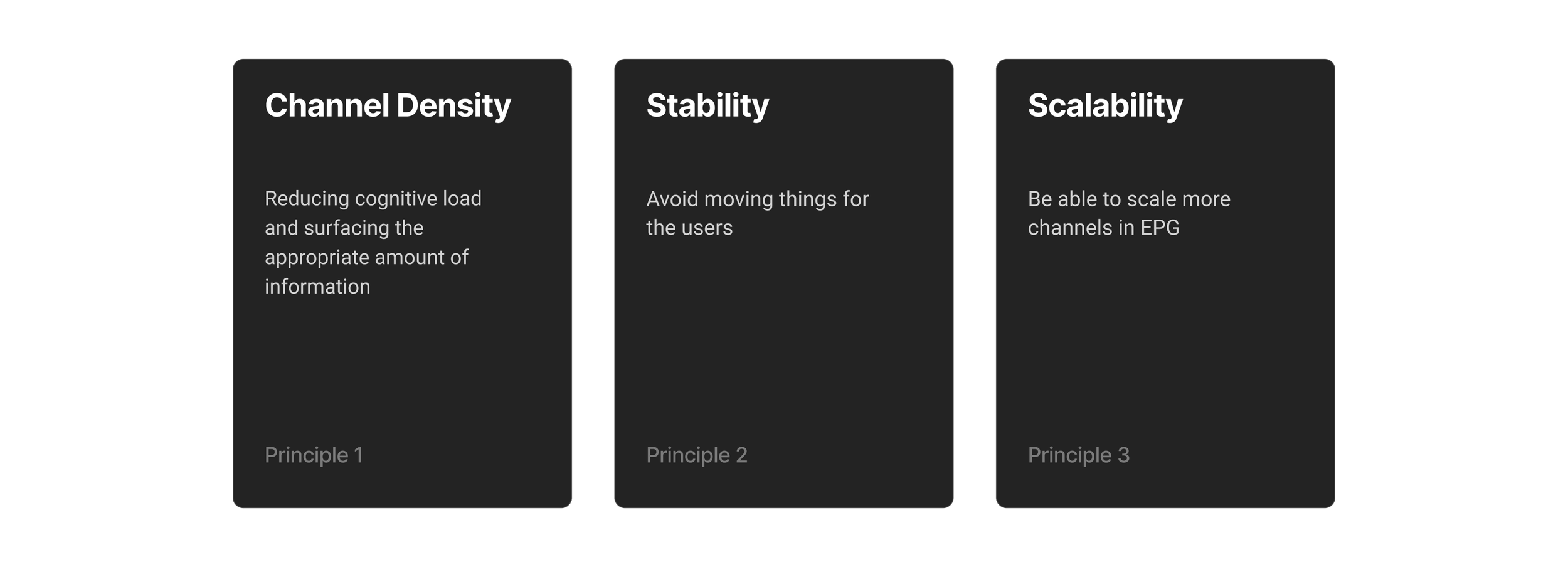
Principles
I think it is important to maintain guiding principles so that the project never veers off course. This three principles were essential for informing the design decisions.
Testing Two Directions
The main goal of the first user testing session is to evaluate which grid works best for our app. I also wanted to see how some of the updates applied to both resonate with the users.
The goal of the second testing session was to fine-tune the updates made that addressed our current problems.
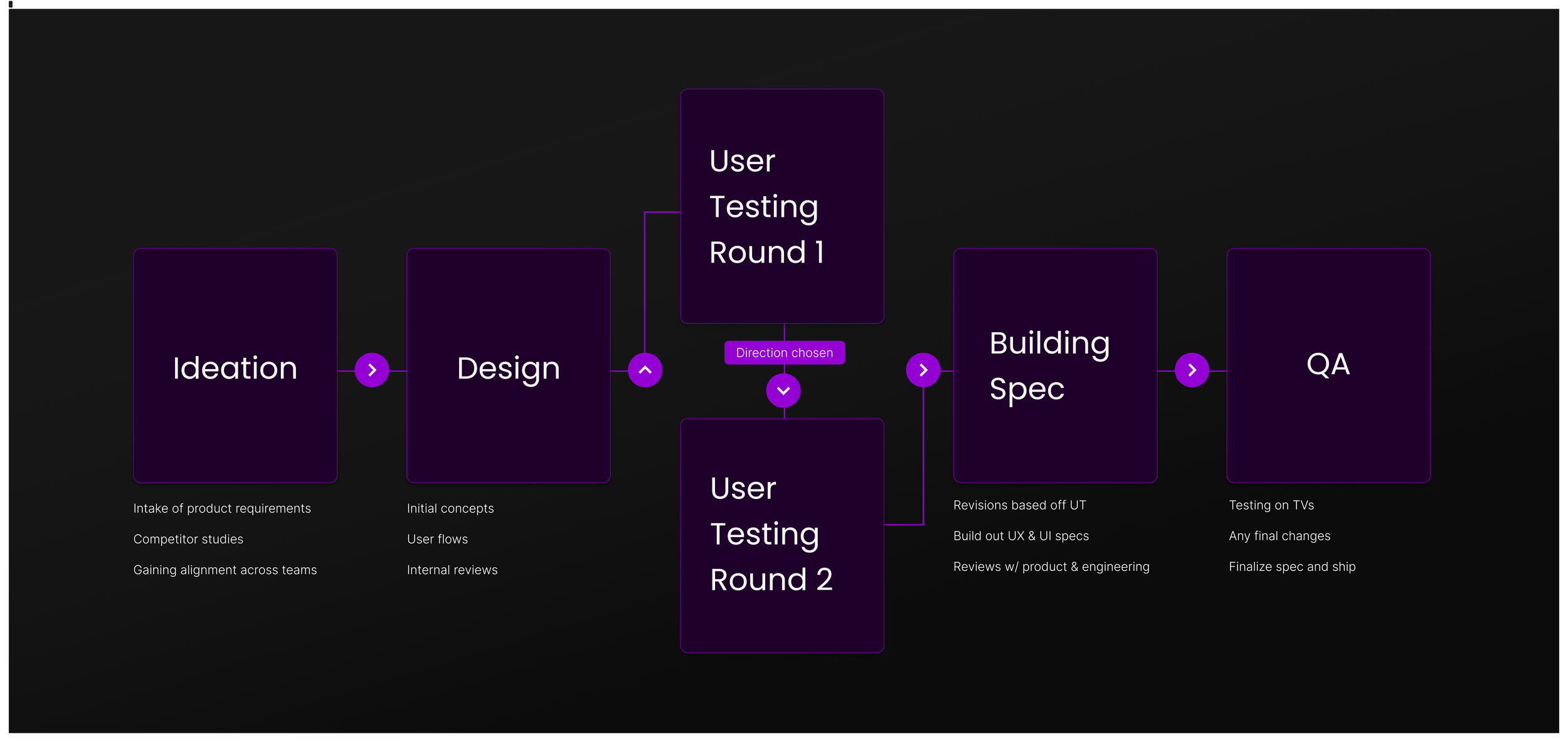
Two Different Grids to Test
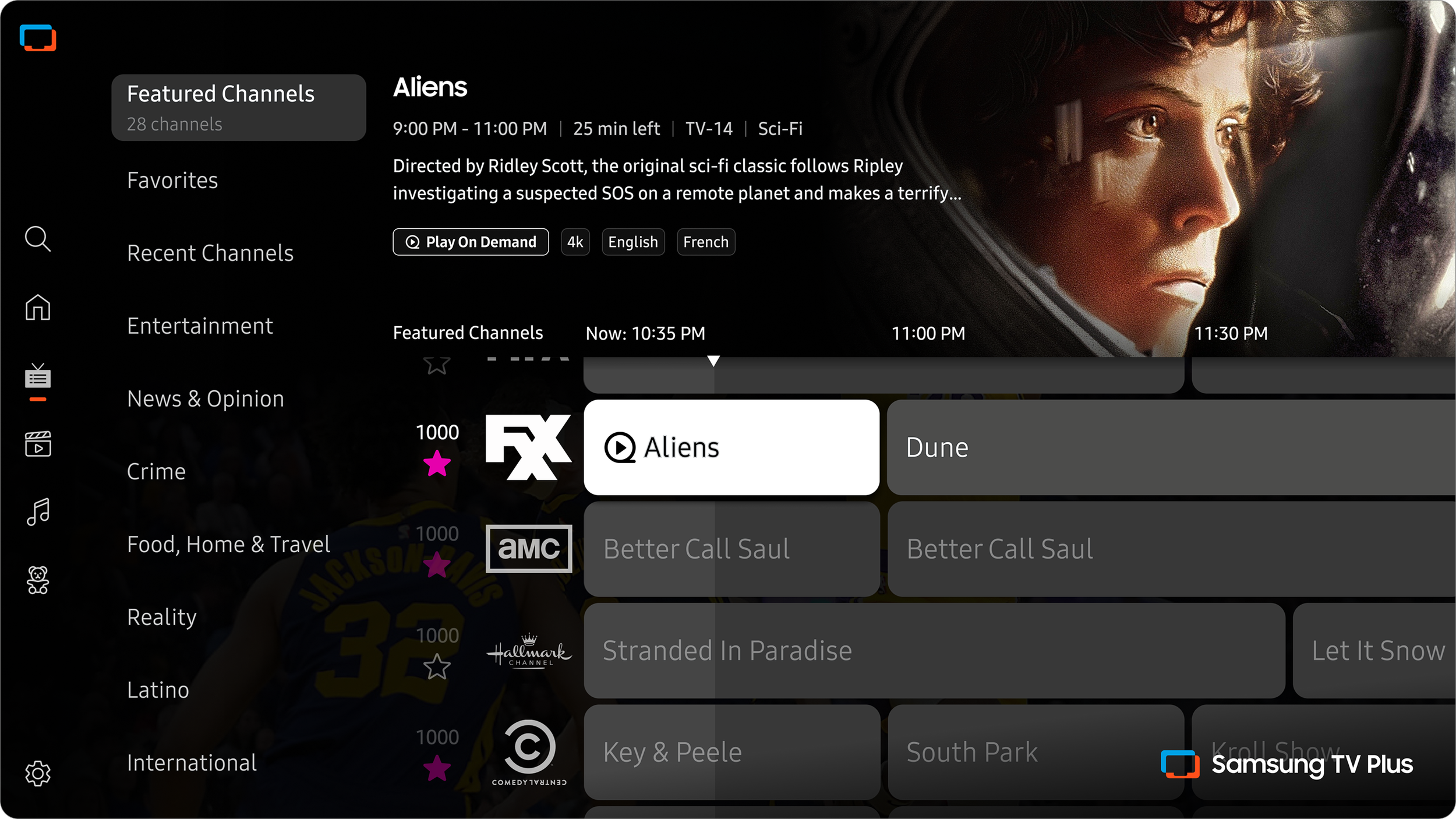
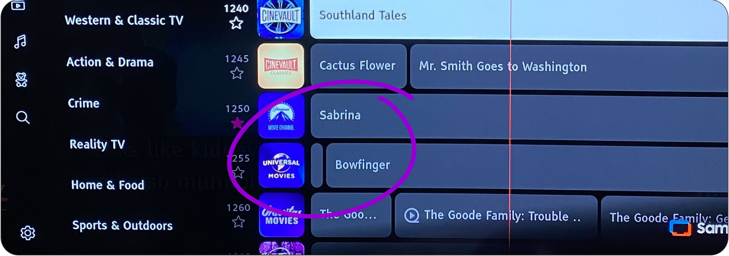
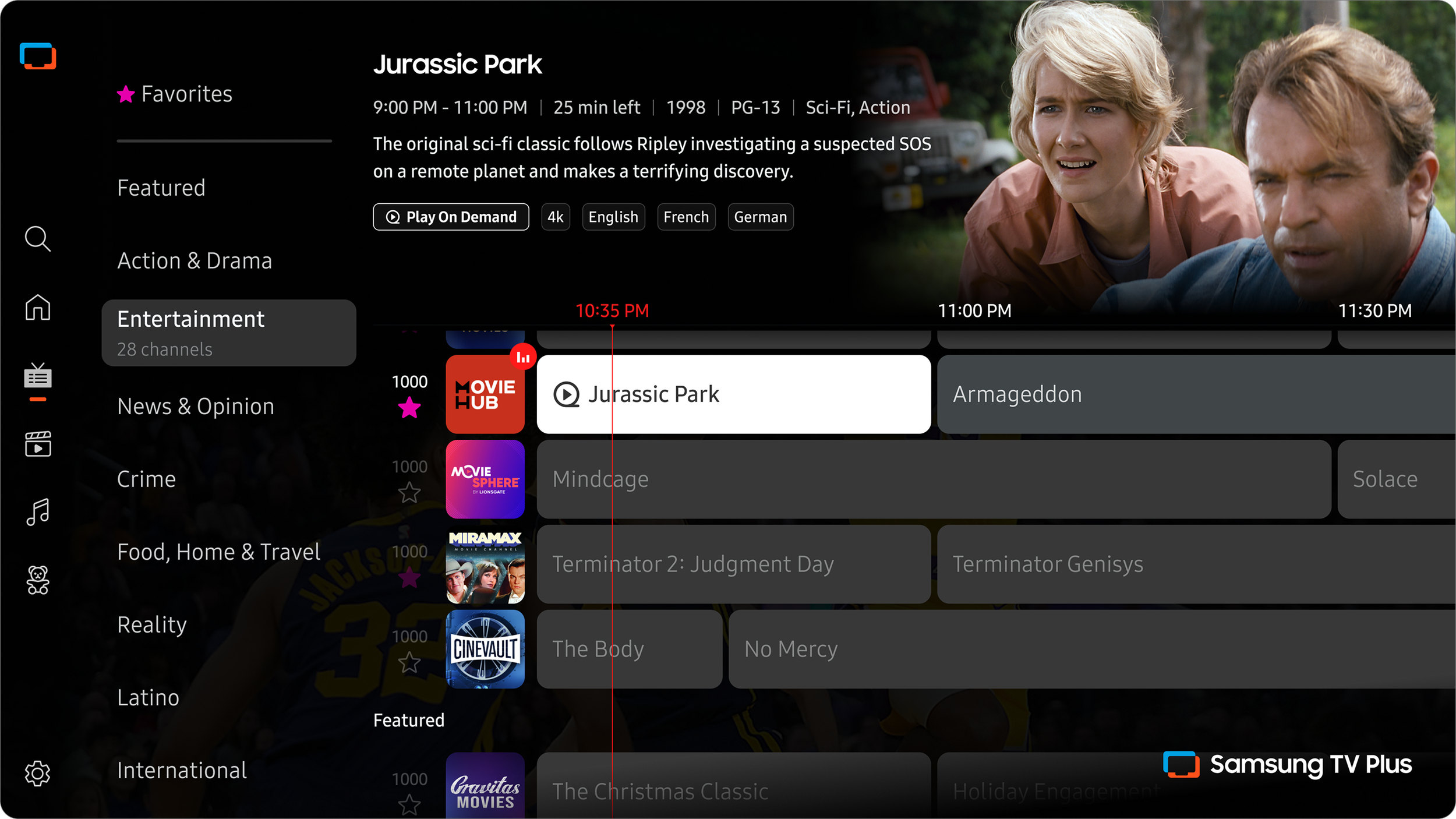
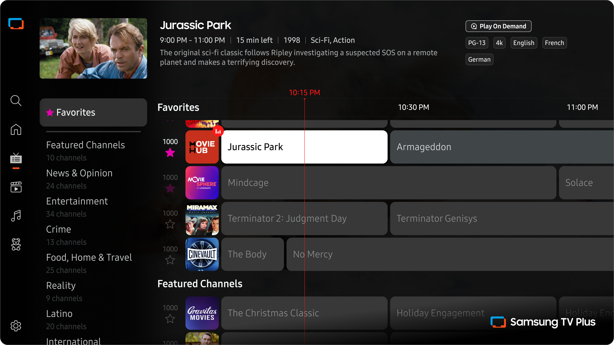
Direction 1: Standard Grid
In option 1, I kept the same standard grid logic. The grid still displays programs airing for the next 7 days. I’ve outlined the UI improvements in the section below.
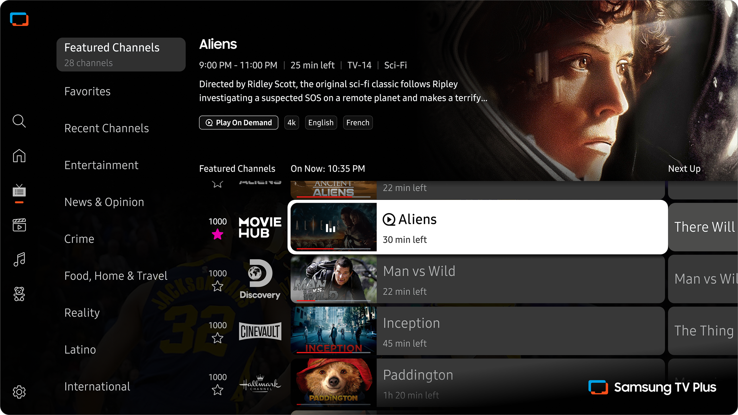
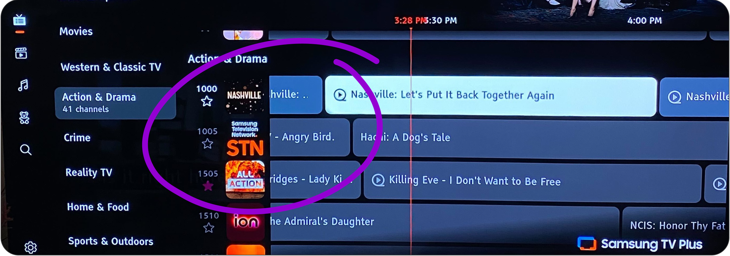
Direction 2: Two-column Grid
For option 2, the content is displayed in two columns: one for live on-now content, the other for the next up programs. I’ve outlined the UI improvements in the following section.

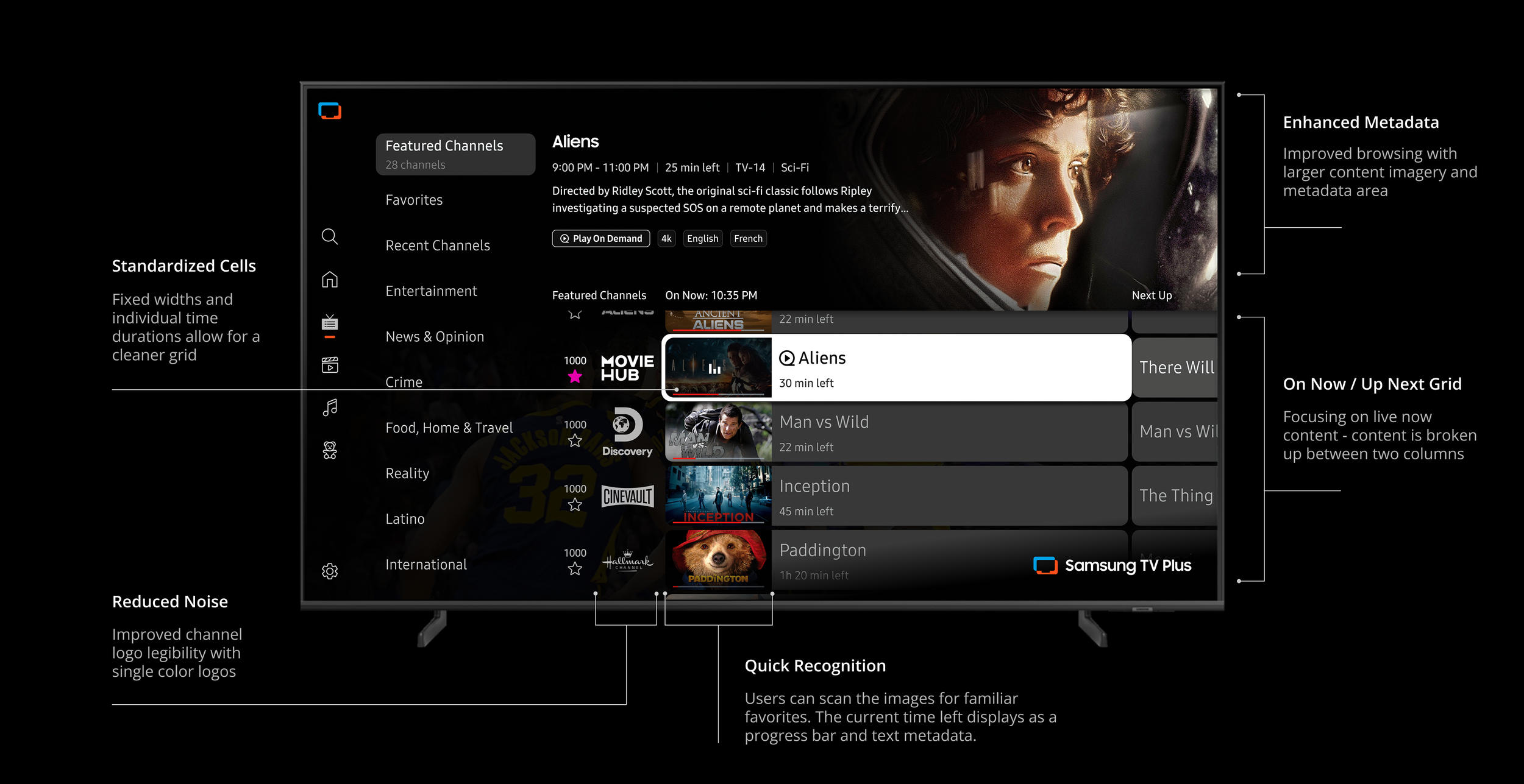
Direction 1
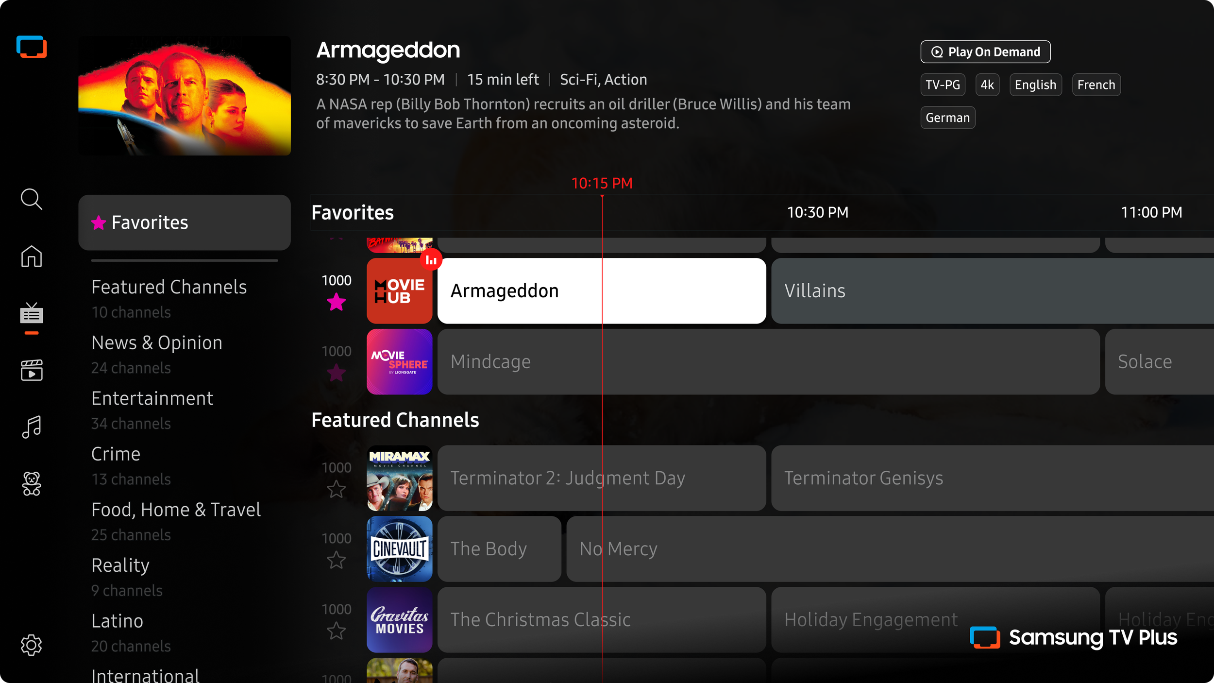
I updated the UI to display the metadata and genres with more impact. The program cells have increased in size to lessen the density. The metadata area for the focused program is now grouped together better in relation to the focus state.
So the program image is now much larger and sits behind the information for the program. Now that the top space has been made free by moving the metadata, we can move the genres up to the top of the screen.
Benefits
Familiar navigation that users won’t need to learn
Allowing users to view programs in the future
The size of the cell shows how much time is left
Challenges
Potential scenarios where there are still too many programs on screen at once
This option does not solve any of the technical backend issues addressed above
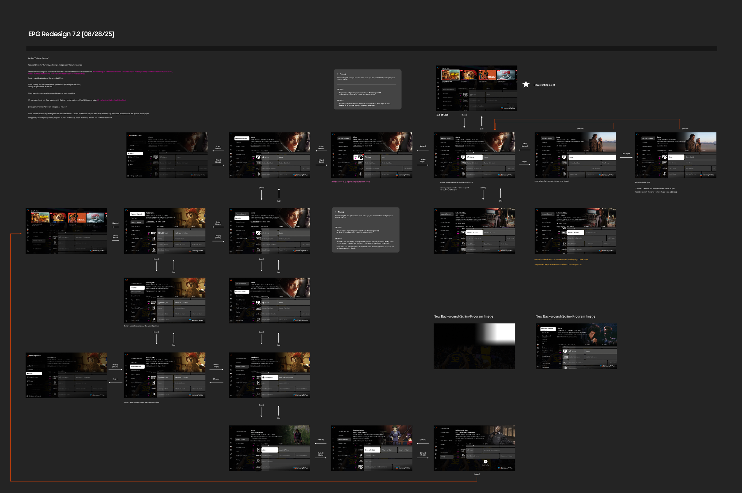
Process
A major part of my process is working through many user flows, like the snapshot below. In the beginning, they are simplified into basic directions to understand all of the edge case scenarios. I jot down tons of notes along the way to document my thoughts and to field questions to other members of the team.
Direction 2
Program cells are all one universal size, ensuring no text is cut off. On the traditional grid, the cell sizes correlate to the length. The time left is displayed on each cell for quick scanning. Additionally, this opens up space to add a program image in the cell to improve finding content at a glance without taking in so much text on screen.
A content-forward approach
A column-based layout without future time stamps
Placing the program info within the grid or in a persistent location
Benefits
Improve channel scanning with image recognition
Two columns with fixed widths and individual time lengths for each program
Less grid movement with fixed focus navigation
Improved navigation to eliminate past programming during browsing
Removing empty text cells
Challenges
Fewer programs for users to view
Possible confusion about the time left in each program
Appearance of a smaller catalog offering
Sourcing additional images for each program
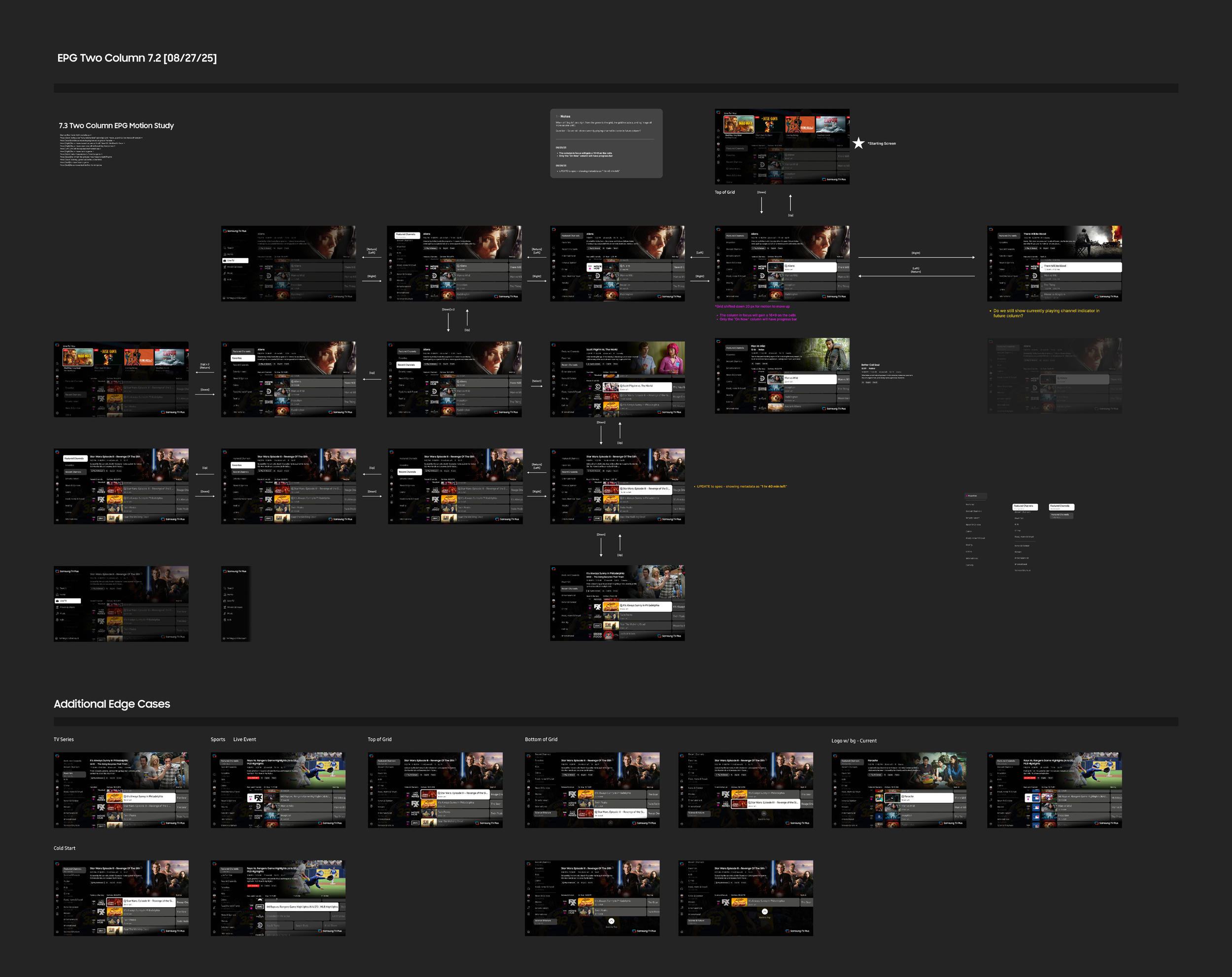
Process
A major part of my process is working through many user flows, like the snapshot below. In the beginning, they are simplified into basic directions to understand all of the edge case scenarios. I jot down tons of notes along the way to document my thoughts and to field questions to other members of the team.
And the winner is…
After conducting a week of UT sessions with 15 users, a clear favorite emerged.

User Testing Round 1 Findings
Users favored Direction 1, being more familiar and comfortable with the standard grid. Direction 2 felt busy to the user, while Direction 1 was visually more appealing. The "on now" column is clean and easy to use, but users had difficulty with the different progress bars.
I was in favor of Direction 2 because it solved the technical backend issues, but this just shows that you need to adapt to change and find new solutions for existing problems.
1
2
3
4
Users favored Direction 1, being more familiar and comfortable with the standard grid.
Direction 2 felt busy to the user (possibly the extra image), while Direction 1 was visually more appealing.
The "on now" column is clean and easy to use, but users had difficulty with the different progress bars.
People are used to the size of the cell showing how much time is left, and this method can lead a user to false excitement when seeing something, only to then find out it’s almost over.
Next Steps
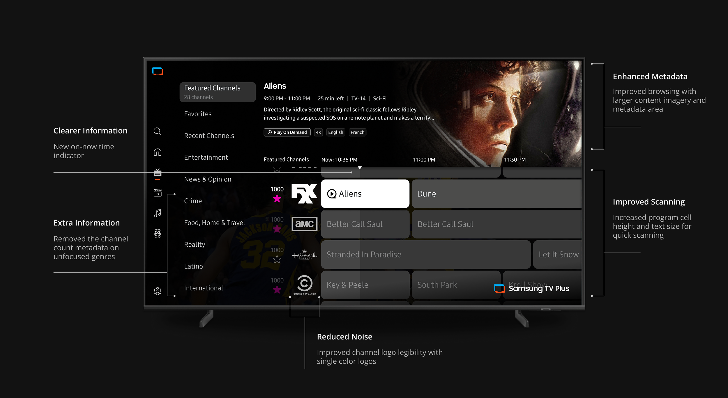
UX Updates
Update requests from the Product Team
Technical Application
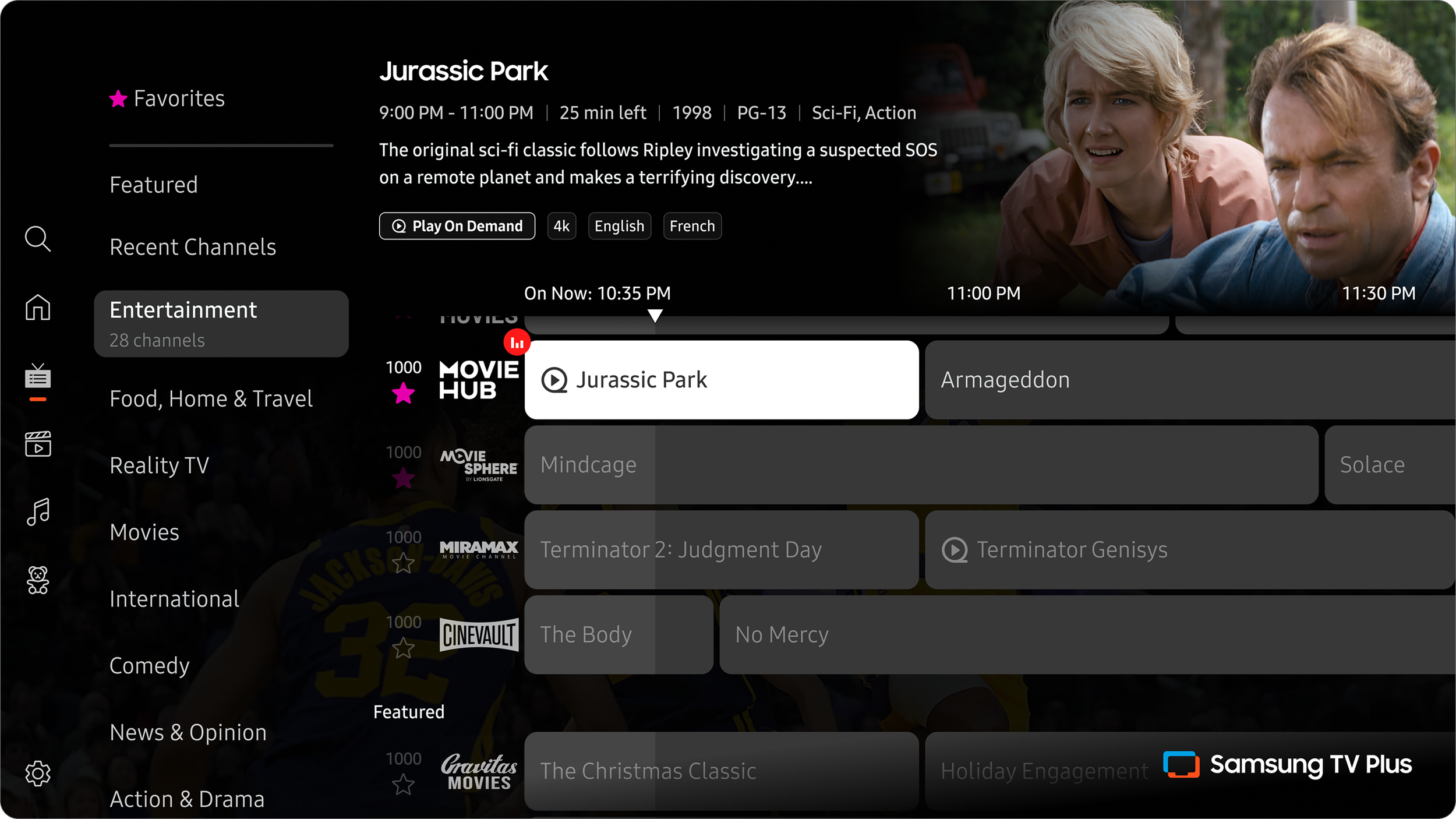
Moving forward with Direction 1, I took the feedback from users and continued refining the experience for the next round of testing.
After sharing the testing results with our Product team, they provided some direction based on business requirements.
There are two conflicting ideals when it comes to displaying information. From the content partners’ side, they want to show as many channels and genres on screen as possible. From the UX side, I want to lighten the cognitive load by lowering the number of channels and genres on screen. So it was a constant back and forth of finding the sweet spot.
Now that we have aligned on the direction, conversations begin with DevOps & Engineering to ensure the updates are feasible.
User Testing Round 2 Findings
Here we honed in on some of the navigational pain points. We discovered a zig-zag browsing issue when navigating from the top row into the grid. Some users also voiced frustration with the [Back] button in some instances.
1
2
3
4
Some users struggled with the zig-zag browsing initially, but once they got used to it, there were no navigational issues.
Users relied heavily on the [Back] button. Suggesting that the grid should reset when users hit back from it, to make sure the timer shows up.
When browsing the grid, because the genres took up half the screen, the users felt that the grid is off to the side of the page. They preferred the grid to be more centered on the page.
Most users first noticed the top row and then the grid, and they wanted to start exploring the grid. So, they would move over to the second tile on the top row (to align on top of the grid) and then press down to get to the grid.
Blockers
Phased Approach
After reviewing the new proposed look and logic with Engineering & DevOps, some blockers were uncovered. There were two features that required more time to be completed.
Current time indicator
Black & white logos
The current time indicator required some restructuring on the backend so it could be taken care of in-house. The new logos required all of our content partners to submit new specs to be uploaded. This caused a delay as there needs to be QA of all the new assets.
Success metrics to monitor after launch
1
2
3
4
Faster time to content from EPG entry
Higher engagement with live content surfaced through the EPG
Increased repeat usage from improvements
Positive user feedback with low churn from legacy viewers
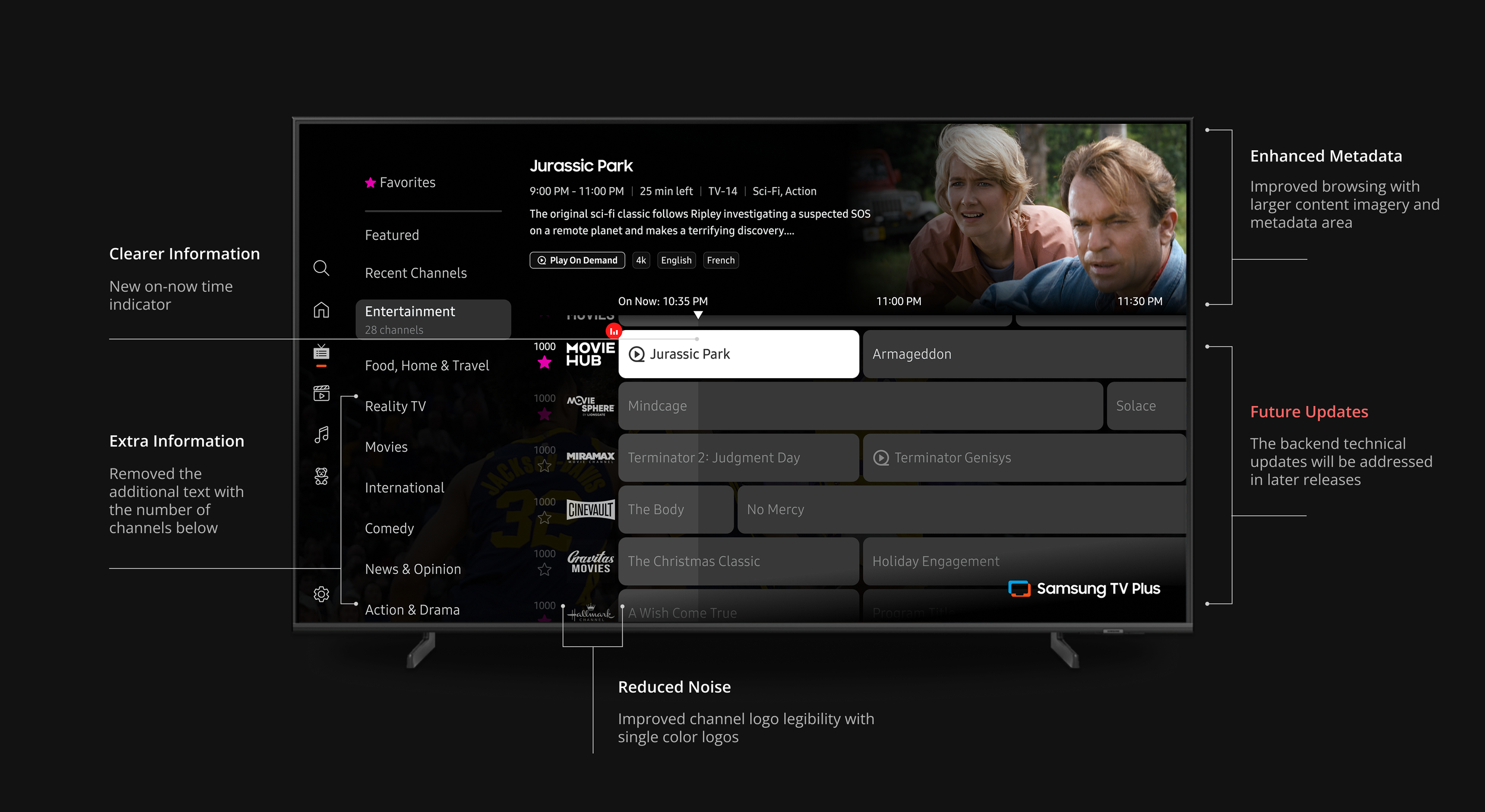
Before
After
Launched Updates
Reflection
With the improvements to the grid that have been launched, I believe it is now in a better place to host the extensive list of new channels. The usability testing validated the UX and UI updates to remove friction. The amount of information was cleaned up and restructured to improve discoverability and increase engagement.
The users speak for themselves
We have our assumptions, but during the user testing sessions, they aren’t always validated.
Understand the product at its roots
Working with engineering and dev ops teams to plan and execute new assets helped inform my design.
Adapt to changing requirements
Two conflicting ideals when it comes to displaying information. On the business side, they want to show as many channels and genres on screen at once. Finding the balance was crucial.