
Where accessibility meets metal.
Br_tal is a database for the illegible beauty of death metal logos.
What is Br_tal?
Growing up, I was a huge fan of death metal, and the extreme logos had a great influence on my love for typography later in life. I had the idea for this years ago, but saw it as a perfect opportunity to practice implementing accessibility. The challenge was to make an accessible tool for the most inaccessible thing. It was a fun experience to go back and rediscover music while working on my craft. The term “brutal” is widely used throughout the metal music scene to describe something that is very heavy.
Some of these logos used are for bands I am not familiar with, and possibly contain explicit content I don’t endorse.


What is Accessibility?
“Digital accessibility refers to the practice of building digital content and applications that can be used by a wide range of people, including individuals who have visual, motor, auditory, speech, or cognitive disabilities.” [Pablo Stanley]
Fun Fact: A11y [Accessibility] is a nureonym . Which is a word where a number is used to form an abbreviation. In this case, letters between the first and last letters are replaced with a number representing the number of letters omitted. Another example would be K9 or W3 for World Wide Web. [Daniel Abrahams]

Inclusive By Design.
Readability, Cognitive Load, Screen Readers, Vision, and Hit Areas are just a few spaces where making accessibility changes can greatly improve the use of a huge audience. While designing Br_tal, I tried to keep account for all of these and more.
Vision: Color Contrast & Color Blindness | Text Size and Scalable Content
Screen Readers: Focused States & Tool Tips
Cognitive Load: Clear Labels & Assistive Text
Hit Areas: Large Clickable Areas / Touch Targets
Physical: Feed & Swipe View on Mobile
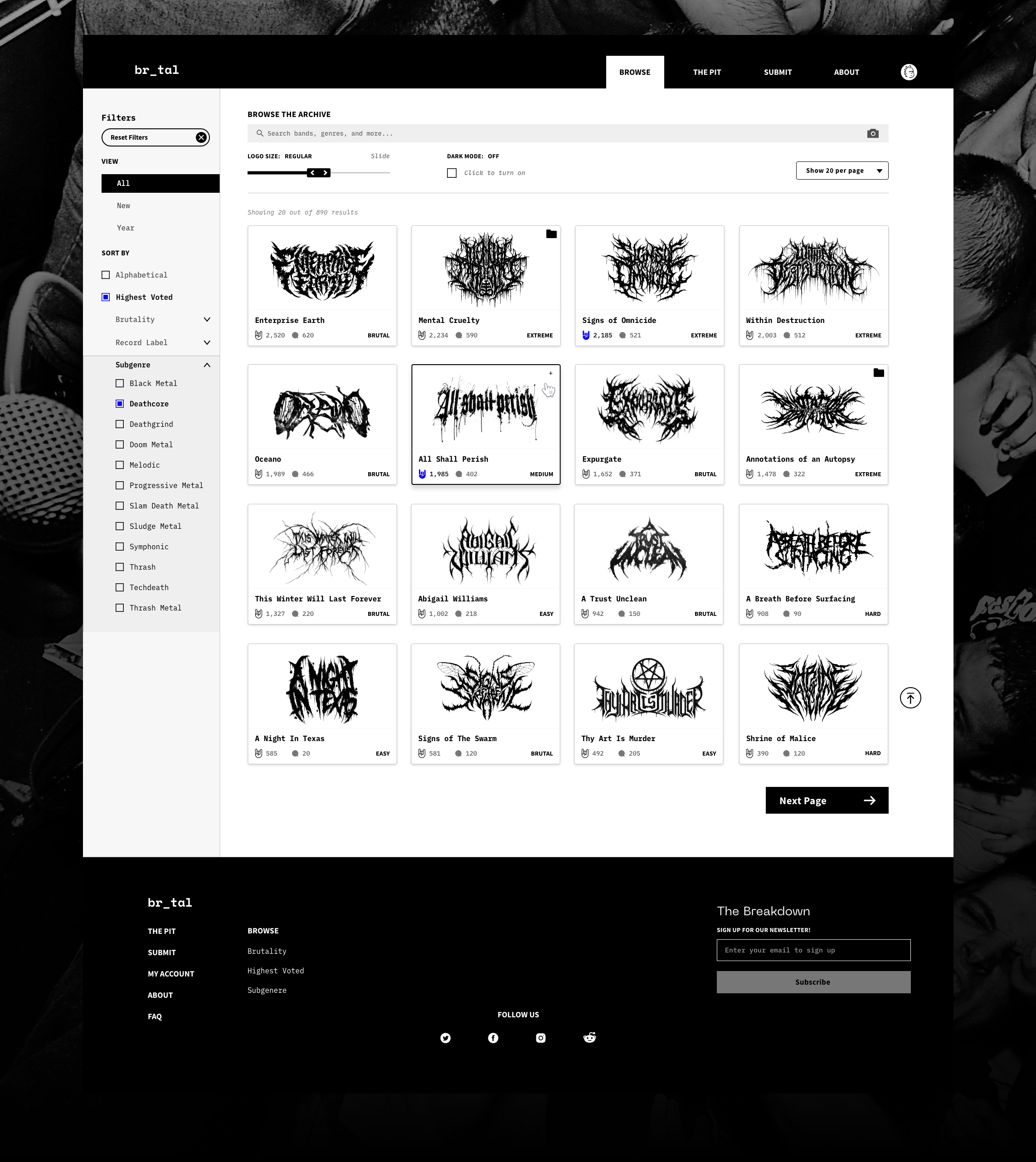
Logos can be searched and filtered. If you have an account, you can like and rate their legibility and all brutality. These are ways to filter results. You can also save logos into collections for a mood board

Every band has a profile page with their bio, discography, & logo designer info. There is also a Spotify player integration to help discover new music while searching. You can also join the discussion in the comment section and argue about genres.

Image Search.
Reverse Search or Search by Image. If you found a logo but don’t know what it says, you can drop it in here and will find it in the database. You can also upload an image to search for similar logos.

Changing the size improves the readability of the logos and the other font sizes on the cards. It can also reduce cognitive load by lessening the amount of logos on screen at once.


Mobile

Swipe View.
Whether you broke your hand in a mosh pit or have motor disabilities you can enter the swipe mode. This allows users to swipe left or right as well as use the bottom buttons. Consolidating down to one logo per screen can also lower the cognitive load. Especially since these logos are quite a thing to wrap your head around.

Helpful Empty States
Empty States are a strong way to improve your user experience but they don’t have to start there. They should provide helpful text to guide the user somewhere else or suggest an action.

Keyboard accessibility requires Focused States & Tool Tips for navigation without a mouse or the use of one.

The above shows two different focused states on the sign-in page. Offering to sign in with Google and other platforms can’t greatly improve the ease of signing up and remove any hesitation about coming up with a new password.
Viewable on all devices…

Drop your phone in the mosh pit?
High contrast and scalable text allow users to still browse the site with a cracked screen.

Still rocking an old system?
The responsive experience is built to scale to any device dimensions. Additionally, there is an emphasis on minimal animations to combat load time.
